
Documentation - Process Gantt
Overview
The Process Gantt visual offers a clear, graphical representation of a project’s progress.
This visual provides an overview of all scheduled tasks, allowing stakeholders to easily understand which tasks need to be completed and by what deadlines. The Gantt chart outlines the start and end dates for each project or activity, presenting a comprehensive timeline.
By analyzing existing processes through the Gantt chart, companies can assess the current state of their operations and identify opportunities for improvement.
Moreover, the Gantt chart can display log data to monitor ongoing processes, such as production or high-frequency data load operations. It tracks the time and duration of each task, enabling the quick identification of potential bottlenecks in the workflow.
For process or process flow charting, the required data should be in the form of an event log or project schedule, which includes the following key components:
- Category/Event/Activity: The specific task or event within the process.
- Parent Category/Project ID: The overarching category or identifier for the project to which the task belongs.
- Timestamps (Start/End): The start and end times for each task or event, providing a clear timeline for the process flow.
The visualization also interacts seamlessly with other visuals, allowing it to filter and affect the display of other elements. Users can customize the Process Gantt visualization through various settings available in the Power BI formatting pane, offering flexibility and control over its appearance and behavior.
- Format bars (color/edge/…)
- Format text (font/color/size/…)
- Format axis
- Format title
- …

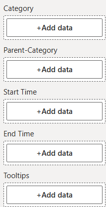
Dropzones
- Category
- 1 x Attribute
- Defines which categories the data will be divided into.
- Parent-Category
- 1 x Attribute
- Divides the categories into parent categories.
- Start Time
- 1 x Attribute
- Contains the time information when the event/action starts.
- End Time
- 1 x Attribute
- Contains the time information when the event/action ends.
- Tooltips
- n x Attributes/Metrics
- The content of the Attributes/Metrics is displayed in the tooltip of the visualization.
- Attributes that are use in one of the other dropzones as well are not displayed in the tooltips.
Formatting settings
Gantt settings
Title
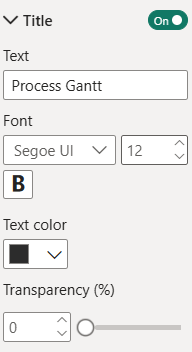
Show Title:
Option to show or hide the Title of the visual.
The following options are available:
- ON
- The Title is displayed.
- OFF
- The Title will not be displayed.
Text:
Assignment of an additional Title that is also displayed in the visualization.
Enter the Title in the text field, this will be accepted unformatted.
Font:
Set the fonts for the Title.
There is a large selection of different fonts, provided by Power BI.
Font size:
Set the font size for the Title.
A range of font sizes is available to suit different layout needs and preferences, with selectable values from 6 pt to 60 pt.
Font weight:
Setting the font weight for the Title, choice between:
- Normal
- Bold
Text color:
Set the font color using Power BI’s built-in color selector.
Color selection options:
- Choose a color from the Power BI color theme using the color picker buttons.
- For more precise customization, enter a hex code directly into the text field within the color picker to define a specific color.
Transparency:
The transparency setting lets you control how transparent the Title appears. A value of 0 means the Title is fully opaque (non-transparent), while 100 makes it completely transparent.
Category
Label
In the options menu Category > Label settings for the formatting of the Category can be adjusted.
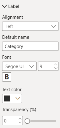
Alignment:
This settings allows you to place the label on the left or the right side.
Default name:
Type in the Default name for the Categroy.
Font:
Setting of the font of the Category.
There is a large selection of different fonts, provided by Power BI.
Font size:
Set the font size for the Category.
A range of font sizes is available to suit different layout needs and preferences, with selectable values from 6 pt to 60 pt.
Font weight:
Setting the font weight for the Category:
- Normal
- Bold
Text color:
Set the font color using Power BI’s built-in color selector.
Color selection options:
- Choose a color from the Power BI color theme using the color picker buttons.
- For more precise customization, enter a hex code directly into the text field within the color picker to define a specific color.
Transparency:
The transparency setting lets you control how transparent the text appears. A value of 0 means the text is fully opaque (non-transparent), while 100 makes it completely transparent.
General bar
These settings are general settings, which allow you to make adjustments for all Category bars (Past bar, Active bar, Future bar, Error bar).
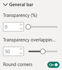
Transparency (%):
The transparency setting lets you control how transparent the Bar appears. A value of 0 means the Bar is fully opaque (non-transparent), while 100 makes it completely transparent.
Transparency overlapping (%):
This Transparency setting lets you control the Bar transparency of the bars which are overlapping.
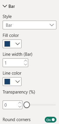
Round corners:
Option to set Round or Square corners of your Bars. The following options are available:
- ON
- The Process bars have round corners.
- OFF
- The Process bars have square corners.
Past bar
In the options menu Category > Past bar, the formatting of the bar for past events can be adjusted.
When is this formatting used?
This formatting is used for all bars with both start time and end time in the past.
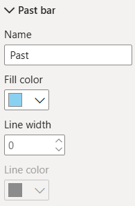
Name:
Choose a name for your Past bar, this one is displayed in the legend and in the tooltip of each bar (Type).
Fill color:
Setting the fill color for the Past bar.
Color selection options:
- Choose a color from the Power BI color theme using the color picker buttons.
- For more precise customization, enter a hex code directly into the text field within the color picker to define a specific color.
Line width:
Set the border width for the Past bar.
When the Line width is at 0 you won’t be able to change to Line color.
Line color:
Setting the border color for the Past bar.
This setting will be disabled when the line width is set to “0“.
Color selection options:
- Choose a color from the Power BI color theme using the color picker buttons.
- For more precise customization, enter a hex code directly into the text field within the color picker to define a specific color.
Active bar
In the options menu Category > Active bar, the formatting of the bar for current events can be adjusted.
When is this formatting used?
This formatting is used for all bars with a start time in the past and an end time in the future.
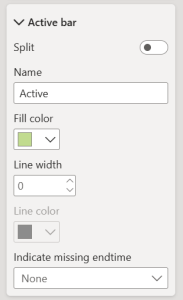
Split:
Option to split the Active bar into two parts, if the ongoing process is overlapping with another one.
The following options are available:
- ON
- The Active bar is split.
- OFF
- The Active bar is not split
Name:
This name is displayed in the Legend (if activated) and in the tooltip of each bar (Type).
Fill color:
Setting the color for the Active bar.
Color selection options:
- Choose a color from the Power BI color theme using the color picker buttons.
- For more precise customization, enter a hex code directly into the text field within the color picker to define a specific color.
Line width:
Set the border width for the Active bar.
When the Line width is at 0 you won’t be able to change to Line color.
Line color:
Setting the border color for the Active bar.
This setting will be disabled when the line width is set to “0“.
Color selection options:
- Choose a color from the Power BI color theme using the color picker buttons.
- For more precise customization, enter a hex code directly into the text field within the color picker to define a specific color.
Indicate missing endtime
This setting allows you to clearly identify events that have been created without a defined end date, often used for ongoing or pending items.
The following options are available:
- None
- Arrow
- Symbol
- Both
Future bar
In the options menu Category > Future bar, the formatting of the bar for future events can be adjusted.
When is this formatting used?
This formatting is used for all bars with both start time and end time in the future.
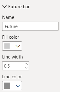
Name:
This name is displayed in the Legend (if activated) and in the tooltip of each bar (Type).
Fill color:
Setting the fill color for the Future bar.
Color selection options:
- Choose a color from the Power BI color theme using the color picker buttons.
- For more precise customization, enter a hex code directly into the text field within the color picker to define a specific color.
Line width:
Set the border width for the Future bar.
When the Line width is at 0 you won’t be able to change to Line color.
Line color:
Setting the border color for the Future bar.
This setting will be disabled when the line width is set to “0“.
Color selection options:
- Choose a color from the Power BI color theme using the color picker buttons.
- For more precise customization, enter a hex code directly into the text field within the color picker to define a specific color.
Error bar
In the options menu Category > Error bar, the formatting of erroneous events can be adjusted.
When is this formatting used?
This formatting is used for all events that cannot be displayed correctly due to an incorrect data set. For example:
- If the end time is before the start time.
- If the start time is missing or has a incorrect format.
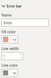
Name:
This name is displayed in the Legend (if activated) and in the tooltip of each bar (Type).
Fill color:
Setting the fill color for the Error bar.
Color selection options:
- Choose a color from the Power BI color theme using the color picker buttons.
- For more precise customization, enter a hex code directly into the text field within the color picker to define a specific color.
Line width:
Set the border width for the Error bar.
When the Line width is at 0 you won’t be able to change to Line color.
Line color:
Setting the border color for the Error bar.
This setting will be disabled when the line width is set to “0“.
Color selection options:
- Choose a color from the Power BI color theme using the color picker buttons.
- For more precise customization, enter a hex code directly into the text field within the color picker to define a specific color.
Duration value
In the options menu Category > Duration value, settings for the duration value of a bar can be adjusted.
The visual only displays the duration of the last event within each Category.
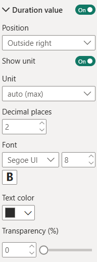
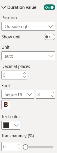
Show Duration:
The toggle on the right side lets you enable/disable the Duration value.
Position:
Lets you configure the position of the text relative to the bar. You can choose from the following:
- Inside right
- Outside right
- Inside left
- Outside left
- Center
Show unit:
The toggle on the right side lets you enable/disable the Duration value unit.
Unit:
Here, the user can choose the unit used to display the Duration value in.
They can choose from the following:
- auto (min): select unit based on the shortest duration
- auto (max): select unit based on the longest duration
- ms
- sec
- min
- h
- days
- weeks
- months
- years
Decimal places:
Specifies the number of decimal places to display for Duration values.
You can choose a value from 0 to 5.
Font:
Setting of the font of the Duration value of the category.
There is a large selection of different fonts, provided by Power BI.
Font size:
Set the font size for the Duration value of the category.
A range of font sizes is available to suit different layout needs and preferences, with selectable values from 6 pt to 60 pt.
Font weight:
Setting the font weight for the Duration value of the category:
- Normal
- Bold
Text color:
Set the font color using Power BI’s built-in color selector.
Color selection options:
- Choose a color from the Power BI color theme using the color picker buttons.
- For more precise customization, enter a hex code directly into the text field within the color picker to define a specific color.
Transparency:
The transparency setting lets you control how transparent the Duration value appears. A value of 0 means the Duration value is fully opaque (non-transparent), while 100 makes it completely transparent.
Parent category
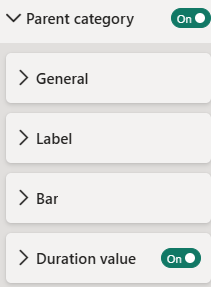
Show Parent category
This setting allows the user to choose, whether the Parent categories should be displayed.
- ON
- The Parent categories are displayed.
- OFF
- The Parent categories are not displayed.
General
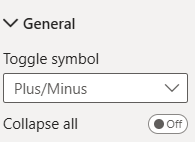
Toggle symbol:
Choose between different Toggle symbols for your Parent category (and bars):
- Arrow
- Plus/Minus
- Plus/Minus square
Collapse all:
This setting allows you to collapse the Parent categories or to unfold them.
Label
Settings for the Labels of parent categories are set in options menu Parent category > Label.
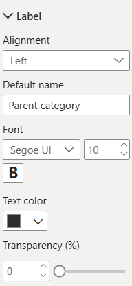
Alignment:
Align the label of the Parent category to the Left or Right.
Default name:
Assignment of an alternative Parent category name that is displayed in the visualization in case no Parent category is available.
Font:
Setting of the font of the Parent category.
There is a large selection of different fonts, provided by Power BI.
Font size:
Set the font size for the Parent category.
A range of font sizes is available to suit different layout needs and preferences, with selectable values from 6 pt to 60 pt.
Font weight:
Setting the font weight for the Parent category:
- Normal
- Bold
Text color:
Set the font color using Power BI’s built-in color selector.
Color selection options:
- Choose a color from the Power BI color theme using the color picker buttons.
- For more precise customization, enter a hex code directly into the text field within the color picker to define a specific color.
Transparency:
The transparency setting lets you control how transparent the label appears. A value of 0 means the label is fully opaque (non-transparent), while 100 makes it completely transparent.
Bar
In the settings menu Parent category > Bar, settings for the Parent category bar can be adjusted.
Style:
Set the Style for the Parent category. This can be a Line or a Bar.
Fill color:
Set the fill color for the Bar.
This setting will be disabled when the Style is set to “Line“.
Color selection options:
- Choose a color from the Power BI color theme using the color picker buttons.
- For more precise customization, enter a hex code directly into the text field within the color picker to define a specific color.
Line width (Bar)/(Line):
Set the line width for the Bar/Line. This setting changes depending on the selected Style.
- Style Line
- Set a value between 1 and 4.
- Style Bar
- Set a value between 0 and 4.
- Style Line
Line color:
Setting the line color for the Bar/Line (depending on the selected Style).
This setting will be disabled when the line width is set to “0“.
Color selection options:
- Choose a color from the Power BI color theme using the color picker buttons.
- For more precise customization, enter a hex code directly into the text field within the color picker to define a specific color.
Transparency:
The transparency setting lets you control how transparent the bar/line appears. A value of 0 means the it is fully opaque (non-transparent), while 100 makes it completely transparent.
Round corners:
Choose between round or square corners of the bar/line of the Parent categories.
Duration value
In the option menu Parent category > Duration value, settings for the duration value of the Parent categories can be adjusted.
Show Duration value:
Set whether the Duration value should be displayed.
- ON
- The Duration value is displayed.
- OFF
- The Duration value is not displayed.
Position:
This setting lets the user decide, where they want the Duration value to be positioned relative to the parent category.
They can choose from the following:
- Inside right
- Outside right
- Inside left
- Outside left
- Center
Show unit:
This setting lets the user decide, whether the Duration value of the parent category should be displayed.
Unit:
Set the unit that is used to calculate/display the Duration value.
They can choose from the following:
- auto
- ms
- sec
- min
- h
- days
- weeks
- months
- years
Decimal places:
Specifies the number of decimal places to display for Duration values.
You can choose a value from 0 to 5.
Font:
Setting of the font of the Duration value of the parent category.
There is a large selection of different fonts, provided by Power BI.
Font size:
Set the font size for the Duration value of the parent category.
A range of font sizes is available to suit different layout needs and preferences, with selectable values from 6 pt to 60 pt.
Font weight:
Setting the font weight for the Duration value of the parent category:
- Normal
- Bold
Text color:
Set the font color using Power BI’s built-in color selector.
Color selection options:
- Choose a color from the Power BI color theme using the color picker buttons.
- For more precise customization, enter a hex code directly into the text field within the color picker to define a specific color.
Transparency:
The transparency setting lets you control how transparent the Duration value of the parent category appears. A value of 0 means the Duration value of the parent category is fully opaque (non-transparent), while 100 makes it completely transparent.
Axis
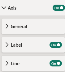
Show Axis:
This setting lets the user choose, whether the visual should have an Axis, what information that Axis should include will be set under General.
General
General settings for the axis of the visual can be adjusted in the options menu Axis > General.
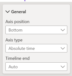
Axis postion:
The position of the Axis can be set “Bottom” or “Top”.
Axis type:
The Axis type can be “Absolute time” or “Relative time”.
Timeline end:
This setting defines the end of the timeline.
- Auto
- Today
Label
In the options menu Axis > Label, settings for the Label of the Axis can be adjusted.

Show line:
The toggle on the right allows you to hide or show the line of the Axis.
Value format:
This setting sets the format of the displayed dates. You can choose from:
- PowerBI Format
- SCvation Format
- Total number
Time zone:
Set the time zone – UTC or Local
Font:
Setting of the font of the Axis label.
There is a large selection of different fonts provided by Power BI.
Font size:
Set the font size for the Axis label.
A range of font sizes is available to suit different layout needs and preferences, with selectable values from 6 pt to 60 pt.
Font weight:
Setting the font weight for the Axis label:
- Normal
- Bold
Font color:
Setting the font color for the Axis label.
Color selection options:
- Choose a color from the Power BI color theme using the color picker buttons.
- For more precise customization, enter a hex code directly into the text field within the color picker to define a specific color.
Transparency:
The transparency function lets you control how transparent the Axis label appears. A value of 0 means the Axis label is fully opaque (non-transparent), while 100 makes it completely transparent.
!Notice the following three options are only available when Total Numbers is chosen above in the Value Settings!
Value scaling (Total number):
Here you can set how you want the Axis label to be scaled. This can be set to milliseconds, seconds, minutes, hours, days, weeks, months or years.
Show unit:
Enable/Disable the unit next to the Axis label.
Decimal places (Total number):
Setting the number of decimal places of the Axis label.
Line
In the options menu Axis > Label, settings for the line of the Axis can be adjusted.
Line width:
Setting the width of the line from 1 to 4.
Line color:
Setting the font color for the line.
Color selection options:
- Choose a color from the Power BI color theme using the color picker buttons.
- For more precise customization, enter a hex code directly into the text field within the color picker to define a specific color.
Transparency:
The transparency setting lets you control how transparent the line appears. A value of 0 means the line is fully opaque (non-transparent), while 100 makes it completely transparent.
Gridlines
Show Gridlines:
The Button on the right allows you to hide or to show the Gridlines.
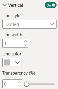
Vertical
In the options menu Gridlines > Vertical, settings for the Vertical Gridlines can be adjusted.
Show Vertical Gridlines:
Set whether the Vertical Gridlines should be displayed.
- ON
- The Vertical Gridlines are displayed.
- OFF
- The Vertical Gridlines are not displayed.
Line style:
Choose between a Solid, Dashed or Dotted style for the gridlines.
Line width:
Setting the width of the line from 1 to 4.
Line color:
Setting the font color for the Gridlines.
Color selection options:
- Choose a color from the Power BI color theme using the color picker buttons.
- For more precise customization, enter a hex code directly into the text field within the color picker to define a specific color.
Transparency:
The transparency setting lets you control how transparent the Gridlines appear. A value of 0 means the Gridlines are fully opaque (non-transparent), while 100 makes it completely transparent.
Horizontal (Parent category)
In the options menu Gridlines > Horizental (Parent category), settings for the horizontal Gridlines of the Parent category can be adjusted.
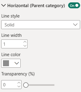
Line style
Choose between a Solid, Dashed or Dotted style for the gridlines.
Line width:
Setting the width of the line from 1 to 4.
Line color:
Setting the font color for the Gridlines.
Color selection options:
- Choose a color from the Power BI color theme using the color picker buttons.
- For more precise customization, enter a hex code directly into the text field within the color picker to define a specific color.
Transparency:
The transparency setting lets you control how transparent the Gridlines appear. A value of 0 means the Gridlines are fully opaque (non-transparent), while 100 makes it completely transparent.
Horizontal (Category)
In the options menu Gridlines > Horizental (Category), settings for the horizontal Gridlines of the Category can be adjusted.
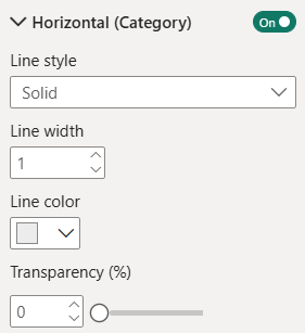
Line style
Choose between a Solid, Dashed or Dotted style for the Gridlines.
Line width:
Setting the width of the line from 1 to 4.
Line color:
Setting the font color for the Gridlines.
Color selection options:
- Choose a color from the Power BI color theme using the color picker buttons.
- For more precise customization, enter a hex code directly into the text field within the color picker to define a specific color.
Transparency:
The transparency setting lets you control how transparent the Gridlines appear. A value of 0 means the gridlines are fully opaque (non-transparent), while 100 makes it completely transparent.
Current timestamp
Show Current timestamp:
The toggle on the right allows you to enable/disable the Current timestamp.
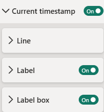
Line
Style:
Choose between a Solid, Dashed or Dotted style for the Current timestamp Line.
Width:
Setting the width of the Line from 1 to 4.
Color:
Setting the color for the Current timestamp Line.
Color selection options:
- Choose a color from the Power BI color theme using the color picker buttons.
- For more precise customization, enter a hex code directly into the text field within the color picker to define a specific color.
Transparency:
The transparency setting lets you control how transparent the Line of the Current timestamp appears. A value of 0 means the Line is fully opaque (non-transparent), while 100 makes it completely transparent.
Label
Show Label:
The toggle on the right allows you to enable/disable the Current timestamp label.
Alignment:
Choose between the options Left, Center and Right to position the Current timestamp label.
Replacement text:
Choose which text is shown instead of the default value. The default value is the Current timestamp. The format of the Current timestamp depends on the format that is set for the Start Time data field.
Font:
Setting of the font of the Current timestamp label.
There is a large selection of different fonts, provided by Power BI.
Font size:
Set the font size for the Current timestamp label.
A range of font sizes is available to suit different layout needs and preferences, with selectable values from 6 pt to 60 pt.
Font weight:
Setting the font weight for the Current timestamp label
- Normal
- Bold
Text color:
Set the font color using Power BI’s built-in color selector.
Color selection options:
- Choose a color from the Power BI color theme using the color picker buttons.
- For more precise customization, enter a hex code directly into the text field within the color picker to define a specific color.
Transparency:
The transparency setting lets you control how transparent the text appears. A value of 0 means the text is fully opaque (non-transparent), while 100 makes it completely transparent.
Label box
Show Label box:
The buttom on the right allows you to turn the Label box on or off.
Background color:
Choose a background color for your Label box.
Line width:
Set the border width of the Label box from 0 to 4.
Line color:
Set the border color for the Current timestamp Label box.
Color selection options:
- Choose a color from the Power BI color theme using the color picker buttons.
- For more precise customization, enter a hex code directly into the text field within the color picker to define a specific color.
Transparency:
The transparency setting lets you control how transparent the Label box appears. A value of 0 means it is fully opaque (non-transparent), while 100 makes it completely transparent.
Legend
In this card, settings regarding the Legend can be adjusted.
Show Legend:
The toggle on the right allows you to enable/disable the Legend.
General
Alignment:
Align the Legend to the left, center or right.
Titel
Show titel:
The buttom on the right allows you to turn the titel text of the Legend on or off.
Text:
Set the title for the Legend.
Font:
Setting of the font of the Legend title.
There is a large selection of different fonts, provided by Power BI.
Font size:
Set the font size for the Legend title.
A range of font sizes is available to suit different layout needs and preferences, with selectable values from 6 pt to 60 pt.
Font weight:
Setting the font weight for the text:
- Normal
- Bold
Text color:
Set the font color using Power BI’s built-in color selector.
Color selection options:
- Choose a color from the Power BI color theme using the color picker buttons.
- For more precise customization, enter a hex code directly into the text field within the color picker to define a specific color.
Transparency:
The transparency setting lets you control how transparent the Legends title appears. A value of 0 means it is fully opaque (non-transparent), while 100 makes it completely transparent.
Label
Font:
Setting of the font of the Label.
There is a large selection of different fonts, provided by Power BI.
Font size:
Set the font size for the Label.
A range of font sizes is available to suit different layout needs and preferences, with selectable values from 6 pt to 60 pt.
Font weight:
Setting the font weight for the Label:
- Normal
- Bold
Text color:
Set the font color using Power BI’s built-in color selector.
Color selection options:
- Choose a color from the Power BI color theme using the color picker buttons.
- For more precise customization, enter a hex code directly into the text field within the color picker to define a specific color.
Transparency:
The transparency setting lets you control how transparent the Label appears. A value of 0 means it is fully opaque (non-transparent), while 100 makes it completely transparent.
Tooltips
Show Tooltips:
The toggle on the right allows you to enable/disable the Tooltips.
Advanced
Batch load
The Batch Load feature improves performance by rendering the visual in smaller batches rather than loading the entire dataset at once. This reduces the initial load time of both the visual and the report. As users scroll to the bottom of the visual or click a designated button, additional data is dynamically loaded and displayed.
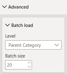
Level:
Specifies the granularity at which data loading is limited:
- All: Loads the entire dataset.
- Parent category: Loads a specified number of parent categories.
- Category: Loads a specified number of categories.
Batch size:
Defines the number of parent categories or categories to load initially. As users scroll to the bottom of the visual, the next batch is automatically loaded based on this setting.
Notifications
Show Notifications:
Set whether Notifications should be displayed.
- ON
- The Notifications are displayed.
- OFF
- The Notifications are not displayed.
License Notifications cannot be disabled!
Quick Menu
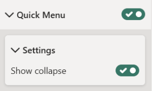
Show Quick Menu:
This setting lets the user enable a Quick menu on the left side of the visual to have quick access to certain features. Which settings that Quick Menu should include will be set under Settings.
Settings
Show collapse
With this option all categories can be expanded or collapsed at once.
- On
- Off
License
Information about the currently active license.
The visual includes an advanced licensing implementation, allowing it to work with both Microsoft AppSource plans, as well as custom license keys issued directly by SCvation GmbH. Additionally, the visual can be used free of charge, under the constraints of the free tier restrictions.
License type
Displays the type of the currently active license, as well as the progress when activating a new custom license.
The following license types are possible:
- Free
This license type is displayed if no license is available, i.e. no AppSource license has been assigned to your Microsoft/Power BI user and the visual has not been activated with a custom license key. All restrictions of the free tier apply for this license type. - AppSource License Plan
This license type is displayed if your Microsoft/Power BI user has an assigned AppSource license for the visual. After purchasing a plan on AppSource, the licenses need to be assigned in the Microsoft 365 Admin Center. Please note that because this license type is bound to the currently logged in user, it does not guarantee that all report viewers will have a valid license as well. Report viewers that do not have an AppSource license assigned will be subject to all restrictions of the free tier as well. - Licensee Custom License
This license type is displayed if a SCvation provided license key was used to activate the visual, and the license key has not yet expired. Licensee will usually be your company’s name. This license type guarantees that all report viewers can use the visual without restrictions, as the license is bound to the visual instance itself and not to specific users.
Additionally, you may encounter the following messages in this text field, when trying to activate the visual using a custom license key:
- Validating…
This message is displayed if the visual is currently validating the custom license key. If the validation succeeds, the correct license type (see above) will be shown again and the expiry date will be adjusted. Should there be a problem with the validation, one of the below error messages will be displayed instead. No internet access is required to validate a custom license key. - Expired
This error message is displayed if the stored custom license key expired. This can either happen when trying to validate an already expired key, or if a previously valid key has since expired. This error message is permanent and will only go away by validating a different custom license key. If a custom license key expires, the visual will still work, although under the restrictions of the free tier. - Invalid License Key
This error message is displayed if the given text is not a valid license key. After a few seconds the correct license type (see above) type will be shown again. - Invalid Product
This error message is displayed if the given text is a valid custom license key, but for the wrong SCvation product. After a few seconds the correct license type (see above) will be shown again.
License expiry date
If the visual is activated via a license key from SCvation GmbH, you will find the date on which the license expires here.
License key input
License keys purchased from SCvation GmbH can be imported here to activate the visual and remove the free tier restrictions.
Free tier restrictions
Licensed feature
When a valid license is detected, all features of the Process Gantt visualization are fully available without restrictions.
Without a license, settings marked as “Licensed Feature” (indicated by an asterisk * in the formatting pane) cannot be modified. Attempting to change these settings will trigger a notification and a watermark within the visual. These indicators are removed automatically when all licensed features are reset to their default values and the data limit has not been exceeded.
This setup enables you to explore and evaluate the full functionality of the Process Gantt visualization before purchasing a license.
Data limits
If a valid license is not detected, data rendering is limited. In this case, only the first 5 rows of the dataset are displayed in the visual.
When this data limit is reached, a notification and watermark will appear within the visualization to indicate the restriction. These indicators are automatically removed once the dataset falls below the limit, and all “Licensed features” revert to their default state.