Discover insights in your data using our visuals
Visualize your business processes, including automatic variant computation and key metrics
Uncover hidden information in your process data with the Process Flow visual, empowering you to make informed decisions and take appropriate actions.
The Process Flow visual takes your business process data (tickets, tasks, events, activities, ...) in the form of an event log and displays it in a clear and understandable format. Key metrics such as the lead time and number of event occurrences are available out of the box and the automatically computed variants can easily be filtered to gain an even deeper insight.

Visualize process data, tickets, tasks, project phases and timelines with up to millisecond accuracy
The Process Gantt chart provides a clear representation of all process sequences, by displaying the start and end dates of each activity.
This visualization allows companies to assess their current processes and identify areas for improvement by analyzing existing workflows. It can display log data, company processes, tickets, tasks, project phases and schedules to monitor ongoing processes, showing the time and duration of each activity, making it easy to pinpoint potential bottlenecks.
Available for Power BI and MicroStrategy.

Display over 1500 data-driven icons, transforming data points into powerful visual indicators.
This Custom Visual elevates your data presentation to a new, visually engaging level. Choose from a vast library of 1500+ icons and harness the full power of Power BI to display them dynamically and data-driven. Enhance the clarity and aesthetic of your reports with instantly recognizable symbols
Available for Power BI

Create a centralized hub for your entire Power BI ecosystem.
The Landing Page custom visual is the definitive solution for navigating complex Power BI tenants. Instead of jumping between workspaces, this visual provides a streamlined “Command Center” where users can access every report, dataset, dashboard, and app from one unified interface. It is designed specifically for organizations that need a professional, branded entry point for their end-users.
Available for Power BI

Efficiently filter your data in Power BI reports
Unlock the potential of your data with the Data Slicer Visual in Power BI, empowering you to seamlessly filter and visualize your data across various visuals within your reports. Effortlessly manage large datasets by entering numerous data elements into the Data Slicer in list format, enabling efficient data filtering.
Experience streamlined data management with our user-friendly interface, facilitating easy data input and filter configuration. Navigate with ease using the „Quick Menu“, designed for intuitive, swift, and stylish operation, ensuring seamless interaction with your data.
Available for Power BI.

Improve your MicroStrategy reports.
At SCvation, we specialize in enhancing your MicroStrategy experience with our suite of 8 custom visuals. Tailored to meet diverse business needs, our custom visuals provide easy to read data visualization solutions that empower you to make informed decisions with ease. Transform your data into compelling stories with our visualizations today!
1000+ companies use our visuals
"The [Data Slicer] visual meets many of our requirements and helps us to improve the usability and acceptance of Power BI in our company. It highly supports our business departments in their daily business."
Spar Power BI Platform Manager
"Data Slicer is perfect to filter a large data visual for a subset of cases. It helps the user of the model find information of interest quickly. I recommend Data Slicer highly. On top, there is great support from the team at SCvation too."
AppSource Marketplace Review
Why SCvation ?
Experience
Our team is composed of highly skilled professionals with extensive experience over 25+ years in the industry.
Reliability
You can count on us to deliver on time and within budget.
Transparency
We maintain clear and honest communication.
The Latest
Release Notes for Process Flow for Power BI 2.0.7.0
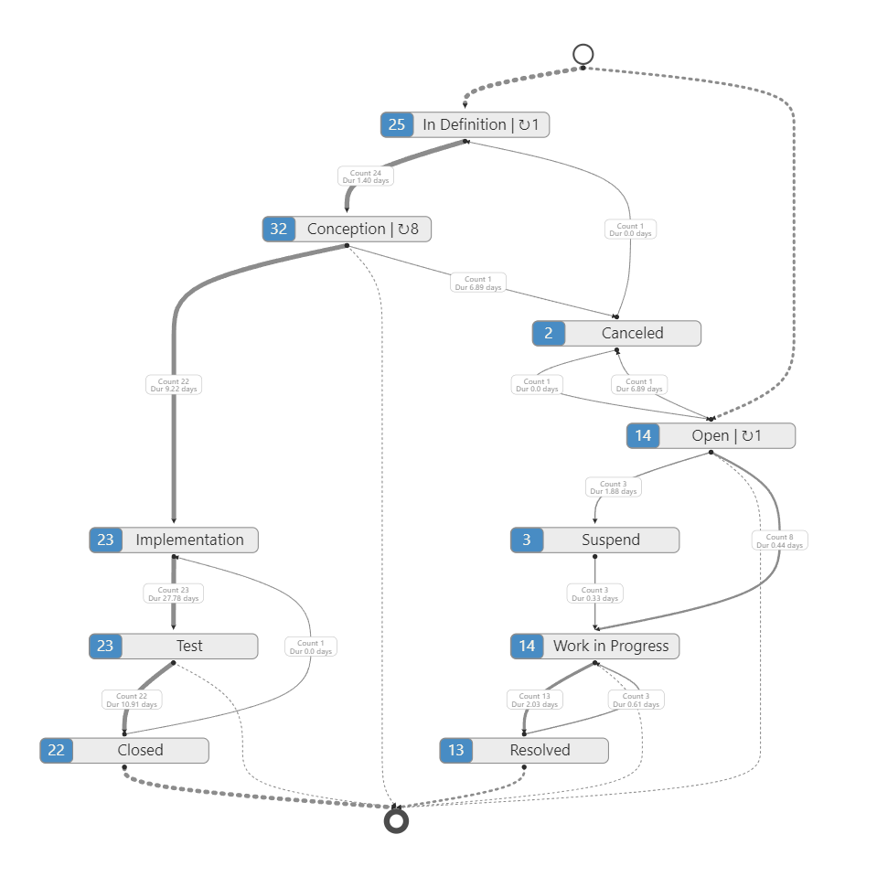
Product: Process Flow visual for Power BI v2.0.7.0Related Product Version: v2.0.7.0Last Updated: April 28, 2026 This release note compares the Process Flow visual v2.0.7.0 with v2.0.5.3, our previous release. New Features Golden Path Highlighting The visual now calculates the transition sequence followed by the majority of cases and applies a distinct, configurable highlight to these paths. Customization options include high-contrast color overlays, variable path widths, transparency, and a specialized “Glow” effect to distinguish the primary flow from deviations. Includes built-in conflict detection that suppresses the highlight if multiple variants share the same highest case count, ensuring data accuracy. Golden Path Metrics Panel A dedicated side panel is now available to provide deep-dive KPIs specifically for the Golden Path compared to the overall process. New Data Loader To improve the user experience during large data refreshes, a new data loader has been...
Release Notes for Dynamic Icon for Power BI 1.0.0.3
Product: Dynamic Icon visual for Power BI v1.0.0.3Related Product Version: 1.0.0.3Last Updated: March 02, 2026 New Visual Icons & Dynamic Icons Icons update based on defined conditions, allowing real-time visual feedback for KPIs, thresholds, and trends. Users can define rule based on measures or values to control which icons are displayed. A wide range of icons is available and can be configured to match specific reporting requirements. Text Text can be customized with features like size, font and color. Background Two different shape options (circle or rectangular). The color and opacity can be configured to support specific visual and styling needs. The border color and width can be fully customized to match individual and reporting design requirements. Shadow settings include support for two configurable shadow colors, as well as an adjustable blur radius to enhance visual depth.