
Documentation - Flow
Overview Flow
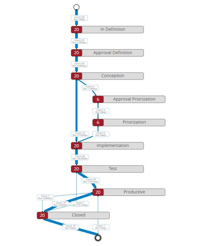
With the analysis of existing processes, inefficiencies and potential for optimization can be found in the process.
With the SCvation Flow Visual, these processes, process developments and the timing of events, actions or activities can be displayed. The events are arranged in the flow visualization according to the chronological sequence. The visualization calculates the number of runs of the cases or process instances and the average duration between the individual events and displays these as key figures in the visualization. The number of runs is also reflected in the line width of the transition.
The data in the form of event logs is required for the representation of processes and process sequences:
- ID/Case/Process Instance
- Event/Action/Activity
- Timestamp
The visualization also interacts with other visualizations, the flow visualization can filter other visualizations. Users can make various settings for flow visualization via their own menu.
- Orientation of the visualization
- Formatting (Color/text/number format/…)
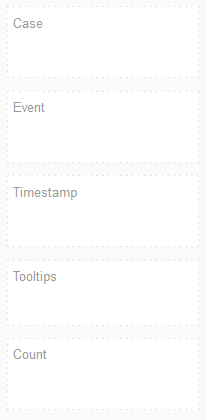
Drop Zone
- Case
- 1 x Attribute
- Contains the runs of the processes
- Event
- 1 x Attribute
- Contains the events/actions that are run through during the process
- Timestamp
- 1 x Attribute
- Contains the time information when the event/action occurs.
- Tooltip
- n Attributes
- Contains poaible Tooltips
- Count
- 1 x Metrik
- MicroStrategy requires a metric to ensure proper data structure.
- A metric is necessary (be filled)
Options-Menu
Menu-Button
Pressing this button opens the SCvation menu.
Various settings and formatting of the visualization can be changed with the menu.
General
General > General
General settings for Orientation, Distinct Events, Zoom Level and Regional Number Formats are set in the General > General options menu:
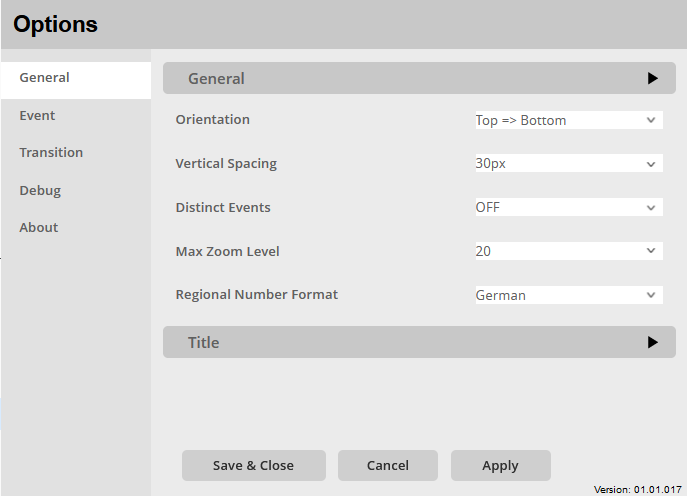
Orientation:
Option to set the orientation of the graph.
The start and end of the process representation are defined.
The following options are available:
- Top=> Bottom
- The process starts at the top and works its way down
- Bottom=>Top
- The process starts at the bottom and the process runs at the top
Vertical Spacement:
Setting to control the vertical spacing between elements of the visual. Choices:
- Fit to Container
- 15px – 60px in 15px steps
Distinct Events:
The visualization takes all events/actions that are passed on. Therefore there is the option in the visualization to only display the unique events/actions.
- OFF
- All events/actions are displayed
- ON
- Only the unique events/actions are displayed
Max Zoom Level:
Option to select the maximum zoom level. Helps to display larger or very large processes legibly.
Setting options:
- OFF
- View is frozen and zooming of the visualization is not possible
- Further zoom levels: 5 – 200
Regional Number Format:
Option to assign the regional number format to the visualization. In particular, this is about the representation of the comma and the thousands separator. A distinction is made between German and English format.
- German
- Thousand separators: “.”
- Decimal place: “,”
- English
- Thousand separators: “,“
- Decimal place: “.“
General > Title
Settings for formatting the title are made and the title is defined in the options menu General > Title:
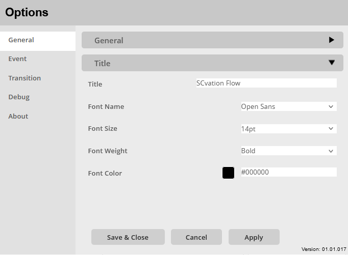
Title:
Assignment of an additional title that is also displayed in the visualization.
- text box
- Enter the title in the text field, this will be accepted unformatted.
Font Name:
Setting the fonts of the title.
There is a large selection of different fonts, including:
- Open Sans
- Comic Sans
- Georgia
Font Size:
Setting the font size for the title, there is a choice of font sizes:
- 6pt-12pt
- 14pt-18pt
- 24pt-32pt
Font Weight:
Setting the font weight for the title, choice between:
- Normal
- Bold
Font Color:
Setting the font color for the title.
Color selection:
- Color-Menu:
- The color can be selected using buttons.
- The colors of the buttons are predefined and can be customized for the specific company.
- Using the text field in the color menu, additional colors can be chosen using a hex code.
Event
Event > General
In the Event > General options menu, general settings for event formatting are made, including the size of the events and the position of the start and end events:
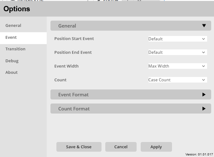
Position Start Event:
Option to automatically reposition the start circle/start event again.
- OFF
- Use the position for the start event given by the library
- ON
- Automatic calculation of the new position of the start event, which can improve the display
Position End Event:
Option to automatically reposition the closing circle/end event again.
- OFF
- Use the position for the end event given by the library
- ON
- Automatic calculation of the new position of the end event, which can improve the display
Event Width:
Setting the width of the events/actions fields
- Individual Width
- Each event/action calculates the width of its field for itself
- Max Width
- Each event/action uses the width of the largest event/action as field width
Count:
Here the count metric of an attribute of the dataset can be rewritten. The attribute must be specified in the tooltips dropzone.
- Case Count
- Here the count is counted automatically
- Dropzone attribute
- Here the count metric can be overwritten by an attribute of the dataset.
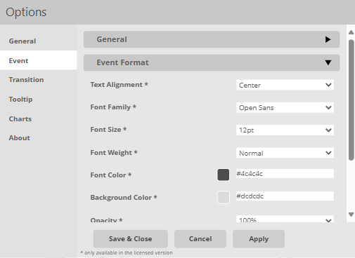
Event > Event Format
Specific settings for event formatting are made in the Event > Event Format options menu, including text and container formatting:
Event > Count Format
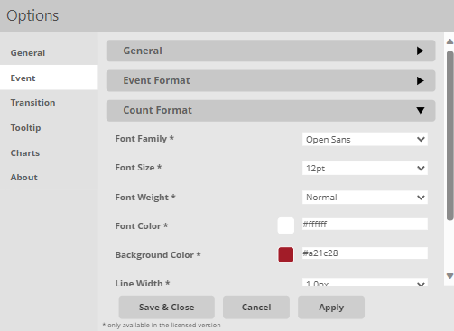
In the Event > Count Format options menu, specific settings are made for the counter of the events formatting, including text, number and container formatting:
Font Name:
Setting the fonts of the event/action description.
There is a large selection of different fonts, including:
- Open Sans
- Comic Sans
- Georgia
Font Size:
Setting the font size for the event/action description, a selection of font sizes is specified:
- 6pt-12pt
- 14pt-18pt
- 24pt-32pt
Font Weight:
Set the font weight for the event/action description, choose between:
- Normal
- Bold
Font Color:
Setting the font color for the event/action description.
Color selection:
- Color menu:
- The color can be selected using buttons.
- The colors of the buttons are predefined and can be customized for the specific company.
- Using the text field in the color menu, additional colors can be chosen using a hex code.
Background Color:
Setting a background color for the event/actions fields.
Color selection:
- Color menu:
- The color can be selected using buttons.
- The colors of the buttons are predefined and can be customized for the specific company.
- Using the text field in the color menu, additional colors can be chosen using a hex code.
Line Width:
Setting the line thickness for the border of the event/action fields.
Choice for formatting:
- OFF
- 0.1px – 8px
Line Color:
Setting a line color for the border of the event/action fields.
Color selection:
- Color menu:
- The color can be selected using buttons.
- The colors of the buttons are predefined and can be customized for the specific company.
- Using the text field in the color menu, additional colors can be chosen using a hex code.
Font Name:
Setting the fonts of the events/actions counter.
There is a large selection of different fonts, including:
- Open Sans
- Comic Sans
- Georgia
Font Size:
Setting the font size for the event/action counter, a selection of font sizes is specified:
- 6pt-14pt
Font Weight:
Setting the font weight for the event/action counter, choice between:
- Normal
- Bold
Font Color:
Setting the font color for the event/action counters.
Color selection:
- Color menu:
- The color can be selected using buttons.
- The colors of the buttons are predefined and can be customized for the specific company.
- Using the text field in the color menu, additional colors can be chosen using a hex code.
Background Color:
Setting a background color for the event/action counter fields.
Color selection:
- Color menu:
- The color can be selected using buttons.
- The colors of the buttons are predefined and can be customized for the specific company.
- Using the text field in the color menu, additional colors can be chosen using a hex code.
Line Width:
Setting the line thickness for the border of the event/action counter fields.
Choice for formatting:
- Very Fine
- Fine
- Normal
- Thick
- OFF
Line Color:
Setting a line color for the border of the event/action counter fields.
Color selection:
- Color menu:
- The color can be selected using buttons.
- The colors of the buttons are predefined and can be customized for the specific company.
- Using the text field in the color menu, additional colors can be chosen using a hex code.
Number Scaling:
Option to break down the numbers of the events/actions counter.
- Tausend [K]
- Millionen [M]
- Billionen [G]
In this format, the counters are displayed with up to two decimal places.
Transition
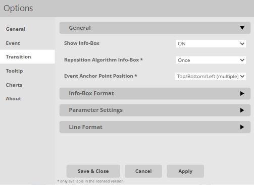
Transition > General
General settings for the transition are made in the options menu Transition > General, including repositioning of the transition info box:
Show Transition Info:
Enable/disable transition info boxes: ON / OFF
Reposition Transition Info:
Option to adjust the position of the transition info box:
- OFF
- The position that is taken by the library
- ONCE
- The info boxes and the transition arrows are checked for overlaps and then automatically repositioned.
- TWICE
- The overlapping check and the repositioning of the info boxes is done twice to eliminate new overlapping by the first repositioning.
Event Anchor Point Position:
Setting to determine the position of the event anchors. The following options are available:
- Top/Bottom (Single)
- Top/Bottom (Multi)
- Top/Bottom/Left (Single)
- Top/Bottom/Left (Multi)
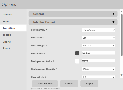
Transition > Info-Box Format
In the options menu Transition > Info box format specific settings for the info box formatting are made, including the display of these info boxes, as well as container and text formatting:
Font Name:
Setting the fonts for the content of the info box.
There is a wide choice
on different fonts, including:
- Open Sans
- Comic Sans
- Georgia
Font Size:
Setting the font size for the content of the info box, a selection of font sizes is specified:
- 6pt-14pt
Font Weight:
Setting the font weight for the content of the info box, choice between:
- Normal
- Bold
Font Color:
Setting the font color for the info box content.
Color selection:
- Color menu:
- The color can be selected using buttons.
- The colors of the buttons are predefined and can be customized for the specific company.
- Using the text field in the color menu, additional colors can be chosen using a hex code.
Background Color:
Setting a background color for the info box.
Color selection:
- Color menu:
- The color can be selected using buttons.
- The colors of the buttons are predefined and can be customized for the specific company.
- Using the text field in the color menu, additional colors can be chosen using a hex code.
Background Opacity:
Setting to determine the opacity of the background. Values from 0% to 100% in 10% steps are available.
Line Width:
Setting the line thickness for the border of the info box.
Choice for formatting:
- OFF
- 0.1px – 8px
Line Color:
Setting a line color for the border of the info box.
Color selection:
- Color menu:
- The color can be selected using buttons.
- The colors of the buttons are predefined and can be customized for the specific company.
- Using the text field in the color menu, additional colors can be chosen using a hex code.
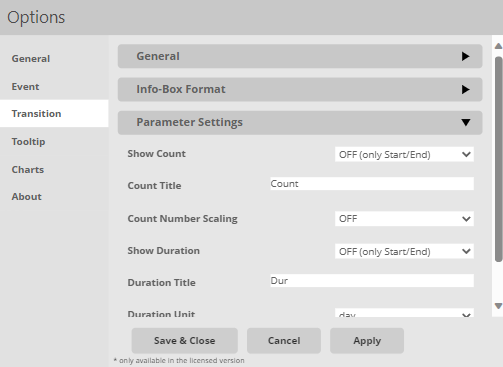
Transition > Parameter
Specific settings for the additional information in the info box are made in the options menu Transition > Parameter , including scaling of the numbers:
Show Count:
Option to display or hide Counts:
- OFF (only Start/End)
- OFF (All)
- ON
Count Title:
Option to choose the Count Title.
Count Number Scaling:
Option to break count of event/action paths counter down to:
- Thousand [K]
- Million [M]
- Billion [G]
In this format, the counters are displayed with up to two decimal places.
Show Duration:
Here, the user can decide, whether they want the duration to be displayed. They can choose from the following settings:
- ON
- OFF (All)
- OFF (Only Start/End)
Duration Title:
This setting lets the user input a custom name for the Duration into the textbox.
Duration Unit:
Option to assign a unit to the time in the info box and to scale the time according to this unit.
The following units are possible:
- ms
- s
- m
- h
- day
- week
- month
- year
Transition > Line
In the options menu Transition > Line specific settings for the transition arrow formatting are made, including formatting of the start and end markers:
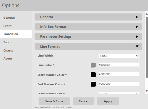
Width:
Setting the line width for the arrows of the transition. You can choose from select thicknesses between 0.1px and 8px. You can also disable it with the option OFF.
Automatic formatting:
- Auto Thick
- The line thickness of the arrows is automatically set according to the number of passes. In this case, the maximum line thickness is the setting -> Thick
- Auto Fine
- The line thickness of the arrows is automatically set according to the number of passes. In this case, the maximum line thickness is the setting -> Fine
Color:
Setting a line color for the transition’s arrows.
Color selection:
- Color menu:
- The color can be selected using buttons.
- The colors of the buttons are predefined and can be customized for the specific company.
- Using the text field in the color menu, additional colors can be chosen using a hex code.
Start Marker Color:
Setting a color for the arrows start of the transition.
Color selection:
- Color menu:
- The color can be selected using buttons.
- The colors of the buttons are predefined and can be customized for the specific company.
- Using the text field in the color menu, additional colors can be chosen using a hex code.
End Marker Color:
Set a color for the transition’s arrowhead.
Color selection:
- Color menu:
- The color can be selected using buttons.
- The colors of the buttons are predefined and can be customized for the specific company.
- Using the text field in the color menu, additional colors can be chosen using a hex code.
Start Marker Size:
Setting the size of the start circle, the transition arrow.
- small
- medium
- large
End Marker Size:
Setting the size of the arrowhead, the end of the transition arrow.
- small
- medium
- large