
Documentation - Fuel
Overview Fuel
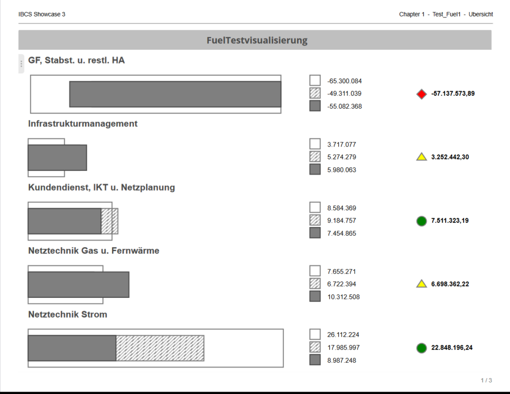
The SCvation Fuel visualization is a visual support and representation of fill levels or comparable data. In addition, this visualization can use conditions and other data to display the differences in detail or identify them using signals, symbols or colors. The latter can be set by the user via additional metrics, the menu and some conditions that the user can set. The bars can also be scaled with each other or always stretched to 100% to improve the display statement.
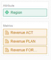
Drop Zone
- Attribute
- 1 x Attribute
- Contains the breakdown of the number of filling levels and the labelling of the respective filling level
- Metrics
- 8 x Metriken
- Contains the data for the various options that can be satisfied by this visualization. Three metrics can be assigned to fill levels. Additional metrics can be used for the additional columns or for the signals or sorting.
Options-Menu
Menu Button
Pressing this button opens the SCvation menu.
Various settings and formatting of the visualization can be changed with the menu.
General
General > General
General settings for orientation, display of visualization components and fill levels are made in the options menu General > General:
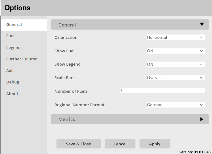
Orientation:
Option to set the orientation of the graph.
The alignment of the filling levels is defined
The following options are available:
- Horizontal
- The fill levels are displayed horizontally, so they span from left to right and the fill levels are displayed one below the other
Show Fuel:
Activate/deactivate the display of the filling level bar
- OFF
- No fuel bars are displayed
- ON
- All fuel bars are displayed
Show Legend:
Activate/deactivate the display of the legend.
- OFF
- No legend is shown.
- The small bar labels and the numbers are not displayed
- ON
- The legend is displayed with the number configuration set
Scale Bars:
Definition of the bar scaling in order to adapt the display of the filling levels to different usage scenarios.
- Individual
- Each fuelscales for itself.
- The fuels are all scaled to 1005 so that they use the full space given.
- Overall
- The fuels are all scaled according to the same factor.
- All fuelss are scaled by the highest fill level that is displayed.
Number of Fuels:
Enter a number of fuels that should be displayed, or the maximum number of fuels that should occur.
If this input exceeds the number of existing fuels, so-called phantom fuels are also added. This should improve the display of the visualization when changing filters.
Application example:
With filtering x 5 fuels are displayed and with filtering y only 2 fuels. Therefore, the 2 fuels with filtering y are very large because they have a lot of space available. However, to display these 2 fuels in the same size as the 5 fuels, by entering 5 here. 3 phantom fuels are added to the 2 fuels, so that the size of the fuels are the same for filtering x and filtering y.
Regional Number Format:
Option to assign the regional number format to the visualization. In particular, this is about the representation of the comma and the thousands separator. A distinction is made between German and English format.
- German
- Thousand separators: “.”
- Decimal place: “,”
- English
- Thousand separators: “,“
- Decimal place: “.“
General > Metrics
General settings for the assignment of metrics are made in the options menu General > Metrics:
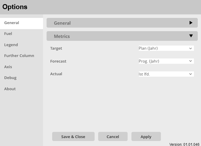
Target:
Mapping one of the metrics as the target metric.
The data from this metric is then used for the target bar.
Forecast:
Mapping one of the metrics as the forecast metric.
The data from this metric is then used for the forecast bar.
Actual:
Mapping one of the metrics as the Actual/Is metric.
The data from this metric is then used for the Actual/Is bar.
Fuel
Select a Section/Metric:
Selector to choose the metric for which the following bar formatting should be done.
It is important to note what this metric was declared as in the General menu.
It should therefore always be checked what the metric is declared as and whether it is declared and then do the formatting.
Fuel > Format Bar
Specific settings for formatting the bars for the individual metrics are made in the Fuel > Format Bar options menu:
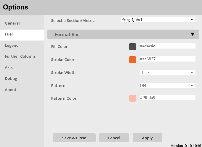
Fill Color:
Setting a fill color of the bar.
Color selection:
- Color menu:
- The color can be selected using buttons.
- The colors of the buttons are predefined and can be customized for the specific company.
- Using the text field in the color menu, additional colors can be added using a hex code.
Stroke Color:
Setting the line color for the border of the bar.
Color selection:
- Color menu:
- The color can be selected using buttons.
- The colors of the buttons are predefined and can be customized for the specific company.
- Using the text field in the color menu, additional colors can be added using a hex code.
Stroke Width:
Setting the line thickness for the border of the bar.
Choice for formatting:
- Very Fine
- Fine
- Normal
- Thick
Pattern:
Enable/disable filling the bar with a pattern: ON / OFF
Pattern Color:
Set the color of the bar hatching when enabled.
Color selection:
- Color menu:
- The color can be selected using buttons.
- The colors of the buttons are predefined and can be customized for the specific company.
- Using the text field in the color menu, additional colors can be added using a hex code.
Legend
Select a Section/Metric:
Selector to choose the metric for which the following legend formatting should be done.
It should be noted here that this only applies to the metrics that have been declared as Target, Forecast and Actual bars in the General menu.
Legend > Value
Specific settings for the formatting of the legend numbers for the individual metrics are made in the Legend > Value options menu:
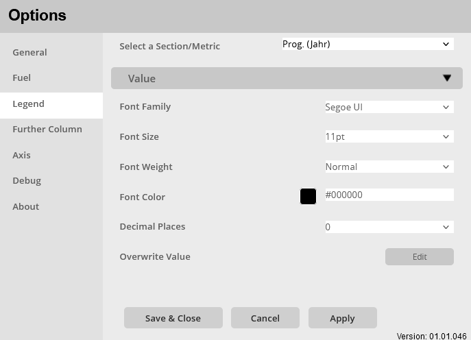
Font Family:
Setting to set the font family for the legend. There are multiple fonts to choose from, including:
- Arial
- Open Sans
- Segoe UI
Font Size:
Setting the font size for the numbers displayed in the legend, a selection of font sizes is specified:
- 6pt-14pt
Font Weight:
Setting the font weight for the numbers displayed in the legend.
Choice between:
- Normal
- Bold
Font Color:
Setting to set the color of the text for the legend.
Color selection:
- Color menu:
- The color can be selected using buttons.
- The colors of the buttons are predefined and can be customized for the specific company.
- Using the text field in the color menu, additional colors can be added using a hex code.
Decimal places:
Set the number of decimal places for the numbers in the legend.
Selection: 0 – 5
Overwrite Value:
Set a condition to overwrite the number displayed in the legend.
Conditions menu:
- Metric selector
- Selection of the metric whose data is to be compared
- Comparison operator selector
- <
- >
- ==
- !=
- <=
- >=
- Value input
- Enter a number to compare with.
- Replacement input
- Enter a number, text or symbol to replace the number in the legend
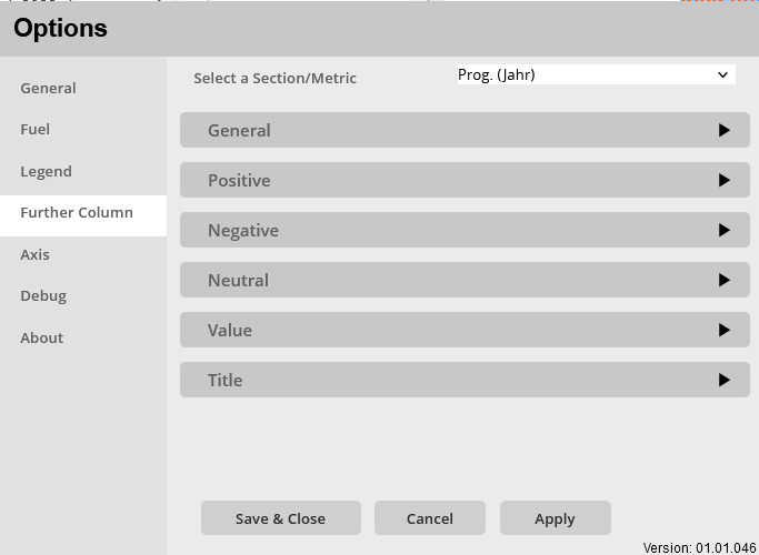
Further Column
Select a Section/Metric:
Selector to choose the metric for which the following formatting should be done.
It should be noted that the metric that is to be used for the further columns must be selected here.
And then the Column Type must be set to declare this metric as a Further Column metric.
All other metrics should be set to OFF.
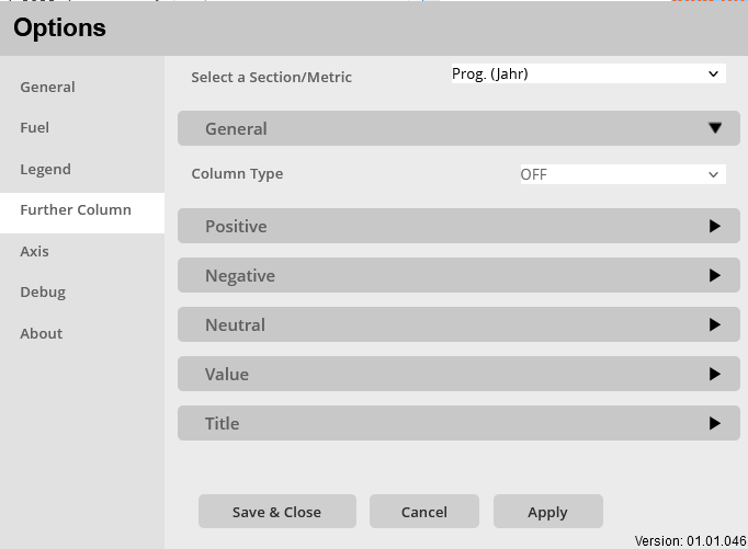
Further Column > General
In the Further Column > General options menu, general settings for the Further Column are made, including the Column Type:
Column Type:
Setting the column type and thus determining which metric is declared as a further column and for which the formatting is carried out.
choices
- OFF
- This metric is not used for the further columns.
- traffic light
- The Further Column is shown as a traffic light with signals. These are defined in the other menu items.
- Value
- The Further Column displays the number and the text of the specified metric. This can be formatted in the other menu items.
- traffic light + value
- The further column is displayed as a traffic light with an additional number or additional text.
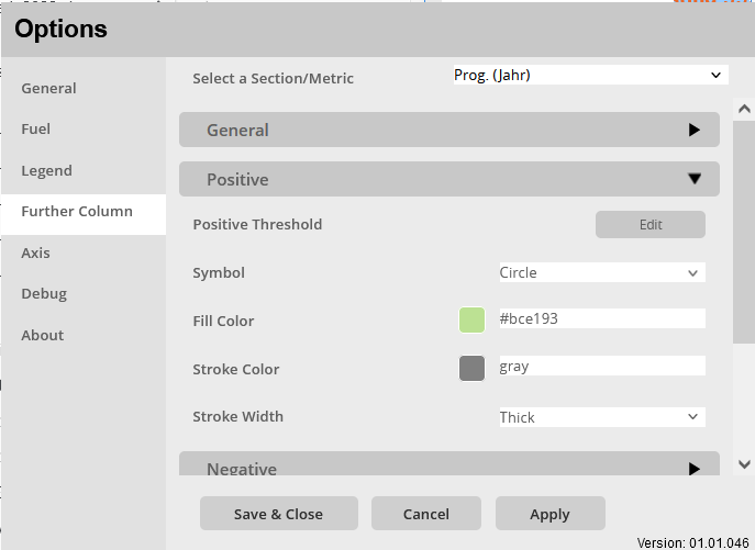
Further Column > Positive
Specific settings for formatting the positive traffic light are made in the Further Column > Positive options menu:
Positive Threshold:
Set the condition when the traffic light/traffic light should show a positive signal.
Conditions menu:
- Metric selector
- Selection of the metric whose data is to be compared
- Comparison operator selector
- <
- >
- ==
- !=
- <=
- >=
- Value input
- Enter a number to compare with.
Symbol:
Selection of the symbol to be displayed when the traffic light shows positive.
Selection:
- –none–
- Diamond
- Triangle
- Circle
Fill Color:
Setting a fill color of the selected symbol.
Color selection:
- Color menu:
- The color can be selected using buttons.
- The colors of the buttons are predefined and can be customized for the specific company.
- Using the text field in the color menu, additional colors can be added using a hex code.
Stroke Color:
Setting a line color for the symbol’s border.
Color selection:
- Color menu:
- The color can be selected using buttons.
- The colors of the buttons are predefined and can be customized for the specific company.
- Using the text field in the color menu, additional colors can be added using a hex code.
Stroke Width:
Setting the line thickness for the outline of the symbol.
Choice for formatting:
- Very Fine
- Fine
- Normal
- Thick
Further Column > Negative
Specific settings for formatting the negative traffic light are made in the Further Column > Negative options menu:
Negative Threshold:
Set the condition when the traffic light should show a negative signal.
Conditions menu:
- Metric selector
- Selection of the metric whose data is to be compared
- Comparison operator selector
- <
- >
- ==
- !=
- <=
- >=
- Value input
- Enter a number to compare with.
Symbol:
Selection of the symbol to be displayed when the traffic light shows negative.
Selection:
- –none–
- Diamond
- Triangle
- Circle
Fill Color:
Setting a fill color of the selected symbol.
Color selection:
- Color menu:
- The color can be selected using buttons.
- The colors of the buttons are predefined and can be customized for the specific company.
- Using the text field in the color menu, additional colors can be added using a hex code.
Stroke Color:
Setting a line color for the symbol’s border.
Color selection:
- Color menu:
- The color can be selected using buttons.
- The colors of the buttons are predefined and can be customized for the specific company.
- Using the text field in the color menu, additional colors can be added using a hex code.
Stroke Width:
Setting the line thickness for the outline of the symbol.
Choice for formatting:
- Very Fine
- Fine
- Normal
- Thick
Further Column > Neutral
Specific settings for formatting the neutral traffic light are made in the Further Column > Neutral options menu:
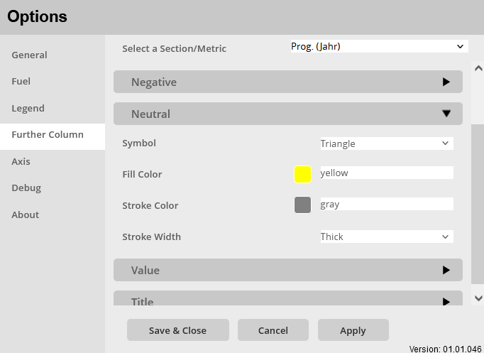
Symbol:
Selection of the symbol to be displayed when the traffic light shows neutral.
Selection:
- –none–
- Diamond
- Triangle
- Circle
Fill Color:
Setting a fill color of the selected symbol.
Color selection:
- Color menu:
- The color can be selected using buttons.
- The colors of the buttons are predefined and can be customized for the specific company.
- Using the text field in the color menu, additional colors can be added using a hex code.
Stroke Color:
Setting a line color for the symbol’s border.
Color selection:
- Color menu:
- The color can be selected using buttons.
- The colors of the buttons are predefined and can be customized for the specific company.
- Using the text field in the color menu, additional colors can be added using a hex code.
Stroke Width:
Setting the line thickness for the outline of the symbol.
Choice for formatting:
- Very Fine
- Fine
- Normal
- Thick
Further Column > Value
Specific settings for the formatting of the displayed text/numbers are made in the Further Column > Value options menu:
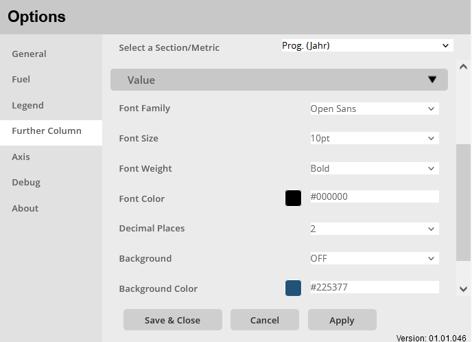
Font Family:
Setting to set the font of the values for the further column. There are multiple fonts to choose from, including:
- Arial
- Open Sans
- Segoe UI
Font Size:
Setting the font size for the numbers/texts displayed in the Further Column, a selection of font sizes is specified:
- 6pt-14pt
Font Weight:
Setting the font weight for the numbers/texts displayed in the Further Column.
Choice between:
- Normal
- Bold
Font Color:
Setting to set the color of the font.
Color selection:
- Color menu:
- The color can be selected using buttons.
- The colors of the buttons are predefined and can be customized for the specific company.
- Using the text field in the color menu, additional colors can be added using a hex code.
Decimals:
Set the number of decimal places for the numbers in the further column.
Of course, it doesn’t work when text is displayed.
Selection:0 – 5
Background:
Activate/deactivate a background for the numbers/texts in the further columns: ON / OFF
Background Color:
Setting a background color for the numbers/texts of the Further Column.
Color selection:
- Color menu:
- The color can be selected using buttons.
- The colors of the buttons are predefined and can be customized for the specific company.
- Using the text field in the color menu, additional colors can be added using a hex code.
Further Column > Column Title
Specific settings for formatting the column title are made in the Further Column > Column Title options menu:
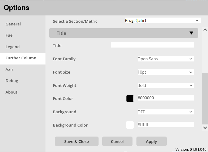
Title:
Enter a title for the Further Column, this will be displayed in the middle above the Further Column.
- Text input field
- Enter the title in the text field, this will be accepted unformatted.
Font Family:
Setting to set the font family of the title for the further column. There are multiple fonts to choose from, including:
- Arial
- Open Sans
- Segoe UI
Font Size:
Setting the font size for the title of the Further Column, a selection of font sizes is preset:
- 6pt-14pt
Font Weight:
Sets the font weight for the Further Column title.
Choice between:
- Normal
- Bold
Font Color:
Setting a font color for the Further Column title.
Color selection:
- Color menu:
- The color can be selected using buttons.
- The colors of the buttons are predefined and can be customized for the specific company.
- Using the text field in the color menu, additional colors can be added using a hex code.
Background:
Activate/deactivate a background for the title of the further columns: ON / OFF
Background Color:
Set a background color for the Further Column title.
Color selection:
- Color menu:
- The color can be selected using buttons.
- The colors of the buttons are predefined and can be customized for the specific company.
- Using the text field in the color menu, additional colors can be added using a hex code.
Axis
Axis > Axis
Specific settings for formatting the axis are made in the options menu Axis > Axis:
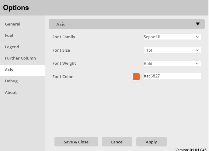
Font Family:
Setting to set the font of the values for the axis. There are multiple fonts to choose from, including:
- Arial
- Open Sans
- Segoe UI
Font Size:
Setting the font size for the texts on the axis, a selection of font sizes is specified:
- 6pt-14pt
Font Weight:
Setting of the font weight for the texts of the axis.
Choice between:
- Normal
- Bold
Font Color:
Setting of the font weight for the texts of the axis.
Choice between:
- Normal
- Bold