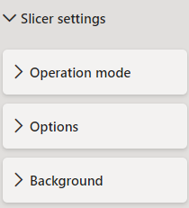

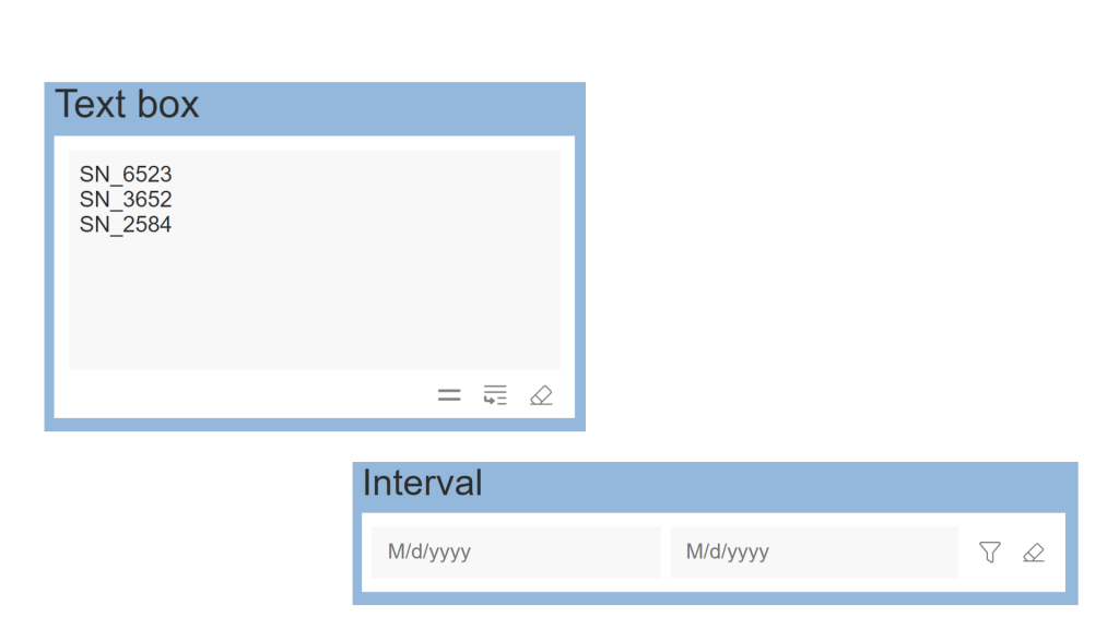
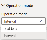
Text box mode | Interval mode |
 When you choose the Text box mode you have:
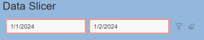
|  When you choose the Interval mode you have:
|
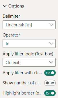
Text box mode | Interval mode |
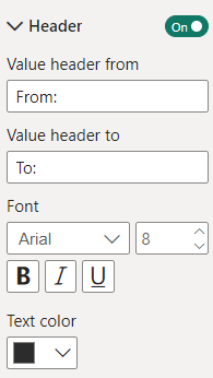
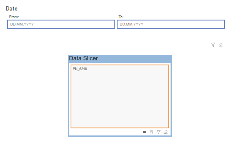
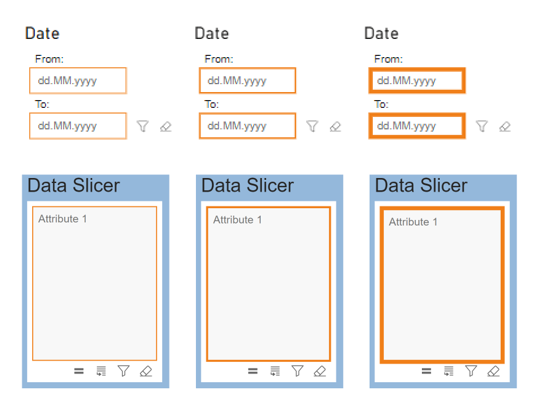
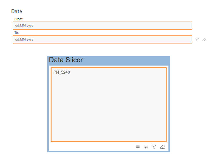
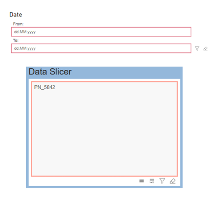
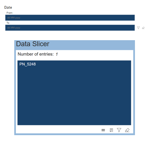
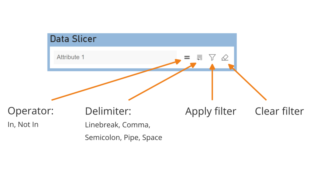
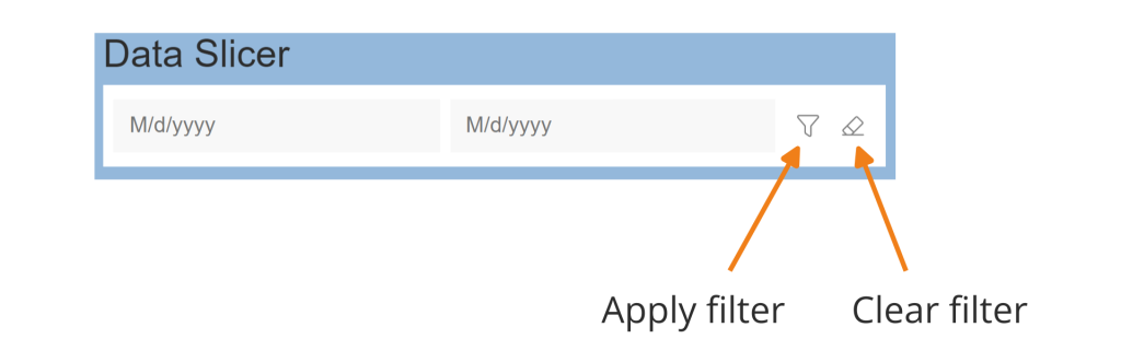
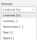
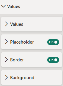
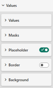
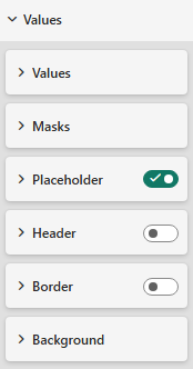
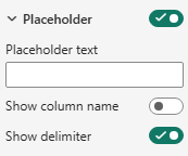 Show Placeholder When the button is deactivated, the placeholder text is hidden so that the text can be entered without predefined instructions. Placeholder text The Placeholder text setting allows you to customize the text that is displayed as a placeholder in the text box of the visualization and is used to provide the report user with information or instructions on what type of information should be entered. If no individual placeholder text has been entered, the default value is the name (data type: text, number) or the date mask (data type: date) of the column from the dataset that was stored in the drop zone of the visualization. Show column name Only when a date attribute is used, the button can be activated to use the column name as a placeholder. data type: datetime  Show delimiter When the delimiter button is enabled, the selected delimiter appears in the placeholder. It indicates how users can insert line breaks. For example: 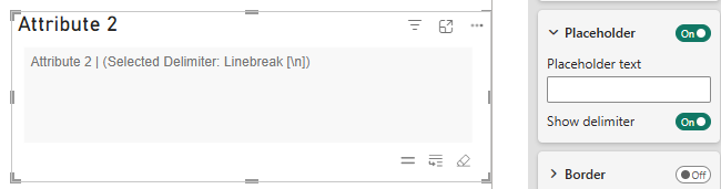 |  Show Placeholder When deactivated, the placeholder text is hidden so that the text can be entered without predefined instructions. Placeholder text from/to Here you can choose your own custom placeholder text. In the follwing it would overwrite the other settings. Use date format as placeholder (deprecated since version 1.3.34.0) When actived, the date mask will be displayed and it will only work if a date format is used. |