Documentation – Gantt
Table of Contents
Add a header to begin generating the table of contents
Scroll to Top
Overview Gantt
The SCvation Gantt Visual can be used to graphically display the progress of a project.
The visual shows an overview of all planned tasks, so that it is clear for everyone involved which work needs to be completed by when. For this purpose, a Gantt chart shows the start and end dates of a project/activity.
By analyzing existing processes, it is possible for a company to assess the current state of its processes and identify opportunities for improvement.
The Gantt chart can also be used to display log data to monitor currently running processes. It shows the time and duration of each activity, making it easy to find potential bottlenecks in a process.
For process or process flow charting, the data is required in the form of event log or project schedules:
- Category/Event/Activity
- Supercategory/Project ID
- Timestamp (start/end)
The visualization also interacts with other visualizations. It can filter other visualizations. Users can make various settings for the Gantt visualization via a dedicated menu.
- Format bars (color/edge/…)
- Format text (font/color/size/…)
- Format axis
- Format title
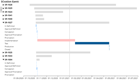
Drop Zone
- Category
- 1 x Attributes
- Defines which categories the data will be divided into.
- Parent Category
- 1 x attributes
- Divides the categories into parent categories.
- Start Time
- 1 x attribute
- Contains the time information when the event/action starts.
- End Time
- 1 x attributes
- Contains the time information when the event/action ends.
- Tooltips
- n x Attributes/Metrics
- The content of the attributes/metrics is displayed in the tooltip of the visualization.
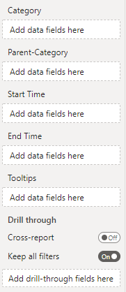
Options-Menu
Menu-Button
Pressing this button opens the SCvation menu. Various settings and formatting of the visualization can be changed with the menu.
![]()
Reset-Button
By pressing the rest button, all selected settings and formattings in the visualization are reset to the default values.
![]()
General
General > General
In the Options menu General > General there is a setting to show a vertical line that marks the current time.
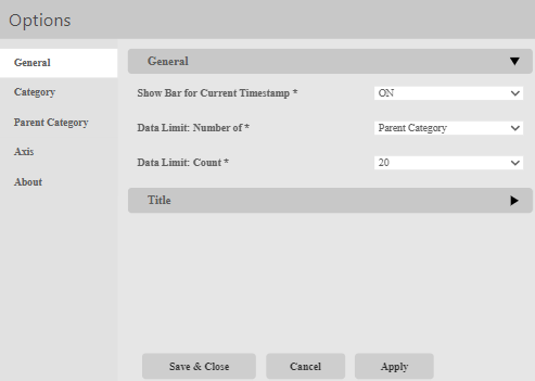
Show Bar for Current Timestamp:
Option to show the current time.
The following options are available:
- ON
- The current time is displayed.
- OFF
- The current time is not displayed.
Data Limit: Number of:
The level at which you limit how much data is loaded. Setting the parent category or category.
Data Limit Count:
The number of the limit that was set in the previous step (with Parent Category or Category).
General > Title
In the Options menu General > Title, settings for the formatting of the title are made and the title is defined:
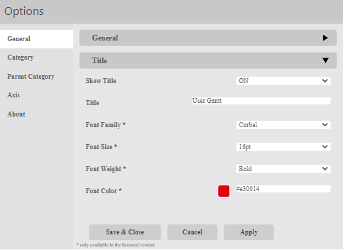
Show Title:
Option to show or hide the title.
The following options are available:
- ON
- The title is displayed.
- OFF
- The title will not be displayed.
Title:
Assignment of an additional title that is also displayed in the visualization.
- text box
- Enter the title in the text field, this will be accepted unformatted.
Font Family:
Setting the fonts of the title.
There is a large selection of different fonts, including:
- Open Sans
- Comic Sans
- Georgia
Font Size:
Setting the font size for the title, there is a choice of font sizes:
- 6pt-12pt
- 14pt-18pt
- 24pt-32pt
Font Weight:
Setting the font weight for the title, choice between:
- Normal
- Bold
Font Color:
Setting the font color for the title.
Color selection:
- Color-Menu:
- The color can be selected using buttons.
- Using the text field in the color menu, additional colors can be chosen using a hex code.
Category
Category > Label
In the options menu Category > Label settings for the formatting of the category are made:
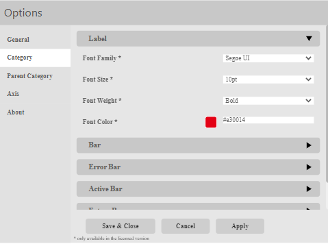
Font Family:
Setting of the font of the Category.
There is a large selection of different fonts:
- Open Sans
- Comic Sans
- Georgia
Font Size:
Font size settings for the category.
A selection of font sizes is provided:
- 6pt-12pt
- 14pt-18pt
- 24pt-32pt
Font Weight:
Setting the font weight for the category:
- Normal
- Bold
Font Color:
Setting the font color for the Category.
Color Selection:
- Color menu:
- The color can be selected using buttons.
- Using the text field in the color menu, additional colors can be selected via a hex code.
Category > Bar
In the options menu Category > Bar, the formatting of the bar for past events can be changed. This formatting is used for all bars with an end time in the past.
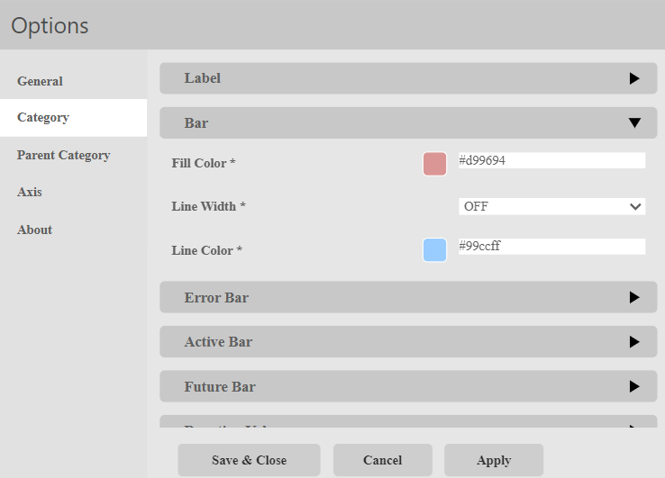
Fill Color:
Setting the fill color for the Bar.
Color Selection:
- Color menu:
- The color can be selected via buttons.
- Using the text field in the color menu, additional colors can be selected via a hex code.
Stroke Width:
Set the stroke width for the Bar.
- OFF
- There is no stroke width.
- Normal
- The line thickness is within the normal range.
- Thick
- The line width is wide.
- Fine
- The line width is narrow.
- Very Fine
- The stroke width is very fine.
Stroke Color:
Setting the stroke color for the Bar.
Color Selection:
- Color Menu:
- The color can be selected via buttons.
- By means of the text field in the color menu further colors can be selected via a hex code.
Category > Error Bar
In the options menu Category > Error Bar, the formatting of erroneous events can be changed. This formatting is used for all events that cannot be displayed correctly due to an incorrect data set. For example, if the end time is before the start time.
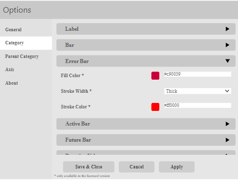
Fill Color:
Setting the fill color for the Error Bar.
Color Selection:
- Color menu:
- The color can be selected via buttons.
- Using the text field in the color menu, additional colors can be selected via a hex code.
Stroke Width:
Set the stroke width for the Error Bar.
- OFF
- There is no stroke width.
- Normal
- The line thickness is within the normal range.
- Thick
- The line width is wide.
- Fine
- The line width is narrow.
- Very Fine
- The stroke width is very fine.
Stroke Color:
Setting the stroke color for the Error Bar.
Color Selection:
- Color Menu:
- The color can be selected via buttons.
- By means of the text field in the color menu further colors can be selected via a hex code.
Category > Active Bar
In the options menu Category > Active Bar, the formatting of the bar for current events can be changed. This formatting is used for all bars with a start time in the past and an end time in the future.
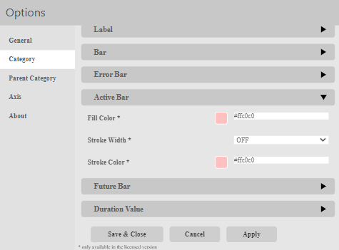
Fill Color:
Setting the fill color for the Active Bar.
Color Selection:
- Color menu:
- The color can be selected via buttons.
- Using the text field in the color menu, additional colors can be selected via a hex code.
Stroke Width:
Set the stroke width for the Active Bar.
- OFF
- There is no stroke width.
- Normal
- The line thickness is within the normal range.
- Thick
- The line width is wide.
- Fine
- The line width is narrow.
- Very Fine
- The stroke width is very fine.
Stroke Color:
Setting the stroke color for the Active Bar.
Color Selection:
- Color Menu:
- The color can be selected via buttons.
- By means of the text field in the color menu further colors can be selected via a hex code.
Category > Future Bar
In the options menu Category > Future Bar, the formatting of the bar for future events can be changed. This formatting is used for all bars with a start time in the future.
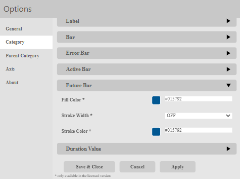
Fill Color:
Setting the fill color for the Future Activity Format.
Color Selection:
- Color menu:
- The color can be selected via buttons.
- Using the text field in the color menu, additional colors can be selected via a hex code.
Stroke Width:
Set the stroke width for the Future Activity Format.
- OFF
- There is no stroke width.
- Normal
- The line thickness is within the normal range.
- Thick
- The line width is wide.
- Fine
- The line width is narrow.
- Very Fine
- The stroke width is very fine.
Stroke Color:
Setting the stroke color for the Future Activity Format.
Color Selection:
- Color Menu:
- The color can be selected via buttons.
- By means of the text field in the color menu further colors can be selected via a hex code.
Category > Duration Value
In the options menu Category > Duration Value, settings for the duration value of a bar are made.
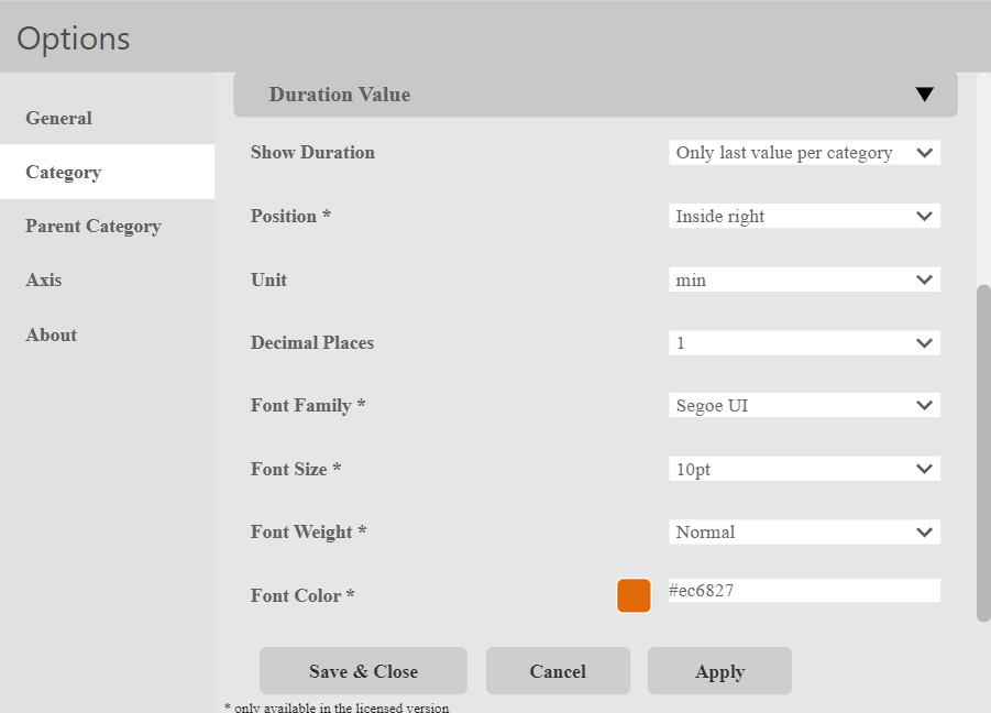
Show Duration:
This setting lets you toggle the duration value on and off.
Position:
Lets you configure the position of the Text relative to the Bar. You can choose from the following:
- Inside right
- Outside right
- Inside left
- Outside left
- Center
Unit:
Here, the user can choose the unit used to display the duration value in.
They can choose from the following:
- ms
- sec
- min
- h
- day
- week
- month
- year
Decimal Places:
Here, the user can choose how many decimal places the duration vaue should have.
They can choose from the following:
- 0
- 1
- 2
- 3
- 4
- 5
Font Family:
Setting of the font of the Category.
There is a large selection of different fonts:
- Open Sans
- Comic Sans
- Georgia
Font Size:
Font size settings for the category.
A selection of font sizes is provided:
- 6pt-12pt
- 14pt-18pt
- 24pt-32pt
Font Weight:
Setting the font weight for the category:
- Normal
- Bold
Font Color:
Setting the font color for the Category.
Color Selection:
- Color menu:
- The color can be selected using buttons.
- Using the text field in the color menu, additional colors can be selected via a hex code.
Parent Category
Parent Category > General
General Settings for the parent categories are made in the options menu Parent Category > General.
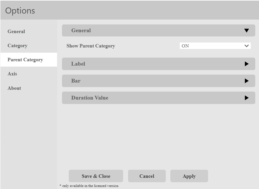
Show Parent Category
This setting allows the user to choose, whether the parent categories should be displayed.
- ON
- The Parent Categories are displayed.
- OFF
- The Parent Categories are not displayed.
Parent Category > Label
Settings for the Labels of parent categories are made in options menu Parent Category > Label.
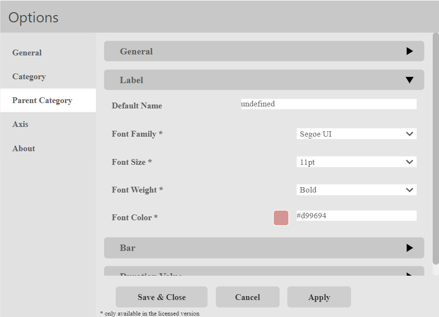
Default Name:
Assignment of an alternative Parent Category Name that is displayed in the visualization in case no Parent Category is available.
- Text field
- Entry of the Name. Will be used unformatted
Font Name:
Setting of the font of the Category.
There is a large selection of different fonts:
- Open Sans
- Comic Sans
- Georgia
Font Size:
Font size settings for the category.
A selection of font sizes is provided:
- 6pt-12pt
- 14pt-18pt
- 24pt-32pt
Font Weight:
Setting the font weight for the category:
- Normal
- Bold
Font Color:
Setting the font color for the Category.
Color Selection:
- Color menu:
- The color can be selected using buttons.
- Using the text field in the color menu, additional colors can be selected via a hex code.
Parent Category > Bar
In the settings menu Parent Category > Bar, settings for the Parent Category Bar are made.
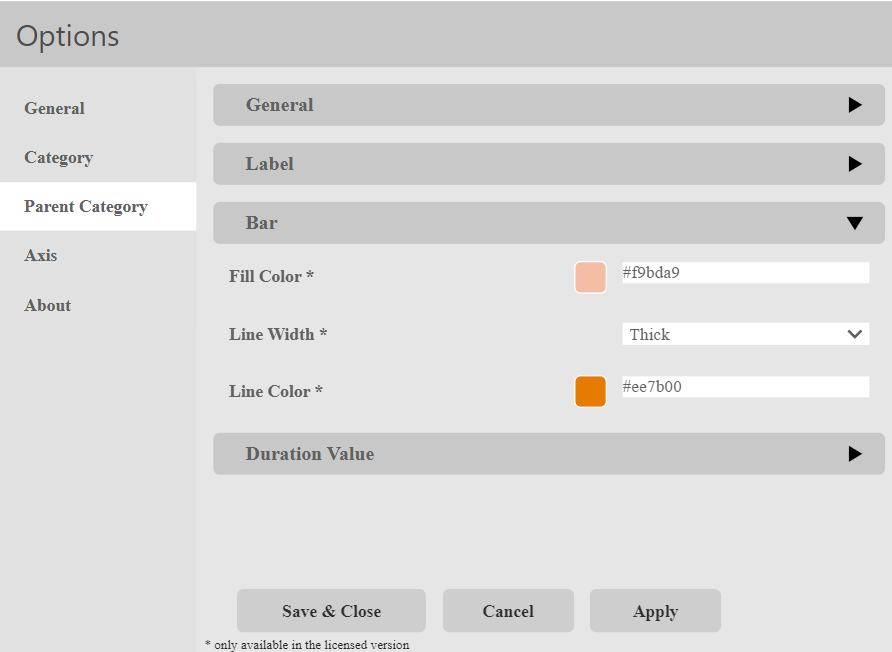
Fill Color:
Setting the fill color for the Active Bar.
Color Selection:
- Color menu:
- The color can be selected via buttons.
- Using the text field in the color menu, additional colors can be selected via a hex code.
Line Width:
Set the stroke width for the Active Bar.
- OFF
- There is no stroke width.
- Normal
- The line thickness is within the normal range.
- Thick
- The line width is wide.
- Fine
- The line width is narrow.
- Very Fine
- The stroke width is very fine.
Line Color:
Setting the stroke color for the Active Bar.
Color Selection:
- Color Menu:
-
- The color can be selected via buttons.
- By means of the text field in the color menu further colors can be selected via a hex code.
Parent Category > Duration Value
In the optione menu Parent Category > Duration Value, settings for the duration value of the parent categories are made.
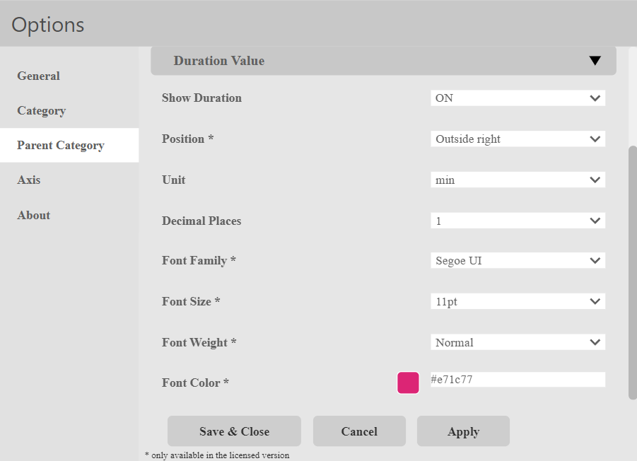
Show Duration:
This setting lets the user decide, whether the duration value of the parent category should be displayed.
Position:
This setting lets the user decide, where they want the duration value to be positioned relative to the parent category.
They can choose from the following:
- Inside right
- Outside right
- Inside left
- Outside left
- Center
Unit:
Here, the user can choose the unit used to display the duration value in.
They can choose from the following:
- ms
- sec
- min
- h
- day
- week
- month
- year
Decimal Places:
Here, the user can choose how many decimal places the duration vaue should have.
They can choose from the following:
- 0
- 1
- 2
- 3
- 4
- 5
Font Family:
Setting of the font of the Category.
There is a large selection of different fonts:
- Open Sans
- Comic Sans
- Georgia
Font Size:
Font size settings for the category.
A selection of font sizes is provided:
- 6pt-12pt
- 14pt-18pt
- 24pt-32pt
Font Weight:
Setting the font weight for the category:
- Normal
- Bold
Font Color:
Setting the font color for the Category.
Color Selection:
- Color menu:
- The color can be selected using buttons.
- Using the text field in the color menu, additional colors can be selected via a hex code.
Axis
Axis > General
General settings for the axis of the visual are made in the options menu Axis > General.
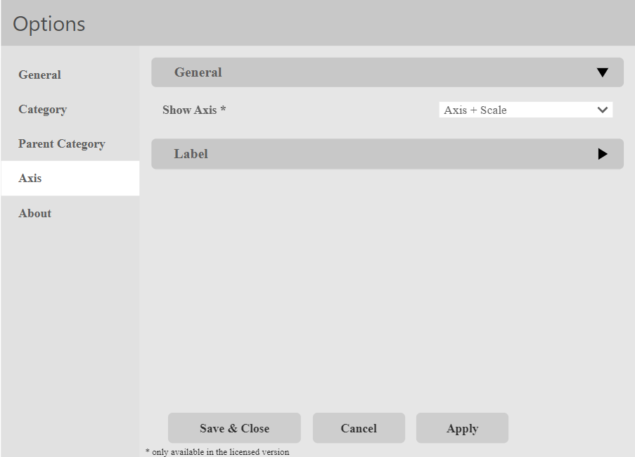
Show Axis:
This setting lets the user choose, whether the Visual should have an axis, and what information that axis should include.
They can choose from these options:
- Off
- Only Axis
- Axis + Scale
Axis > Label
In the options menu Axis > Label, settings for the label of the axis can be changed.
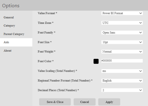
Value Format:
This setting sets the format of the dieplayed dates. You can choose from:
- PowerBI Format
- SCvation Format
We have found, that the PowerBI Format may cause the dates to overlap.
Time Zone:
Setting the time Zone.
Font Family:
Setting of the font of the Category.
There is a large selection of different fonts:
- Open Sans
- Comic Sans
- Georgia
Font Size:
Font size settings for the category.
A selection of font sizes is provided:
- 6pt-12pt
- 14pt-18pt
- 24pt-32pt
Font Weight:
Setting the font weight for the category:
- Normal
- Bold
Font Color:
Setting the font color for the Category.
Color Selection:
- Color menu:
- The color can be selected using buttons.
- Using the text field in the color menu, additional colors can be selected via a hex code.
Value Scaling (Total Number):
Here you can set how you want the axis data to be formatted. This can be set in milliseconds, seconds, minutes, hours, days, weeks, months or years.
Regional Number Format (Total Number):
Setting the language of the axis in German or English.
Decimal Places (Total Number):
Setting the number of decimal places of the axis.
