
Documentation - Process Flow
Overview
Visualize your business processes, including automatic variant computation and key metrics
Uncover hidden information in your process data with the Process Flow visual, empowering you to make informed decisions and take appropriate actions.
The Process Flow visual takes your business process data (tickets, tasks, events, activities, …) in the form of an event log and displays it in a clear and understandable format. Key metrics such as the lead time and number of event occurrences are available out of the box and the automatically computed variants can easily be filtered to gain an even deeper insight.
Key features
- Clear and understandable process visualization, using a directed flow graph.
- Build-in variant computation and visualization, using a selectable bar chart.
- Visualization of key metrics per event/transition as well as for the total process.
- Support for attaching additional data fields to each event, with different aggregation options available.
- Quick-menu to allow report viewers to change certain settings at runtime, for their session only.
- All features customizable using Power BI’s formatting settings, including the color palette.
- Integration with common Power BI features such as formats and selections.

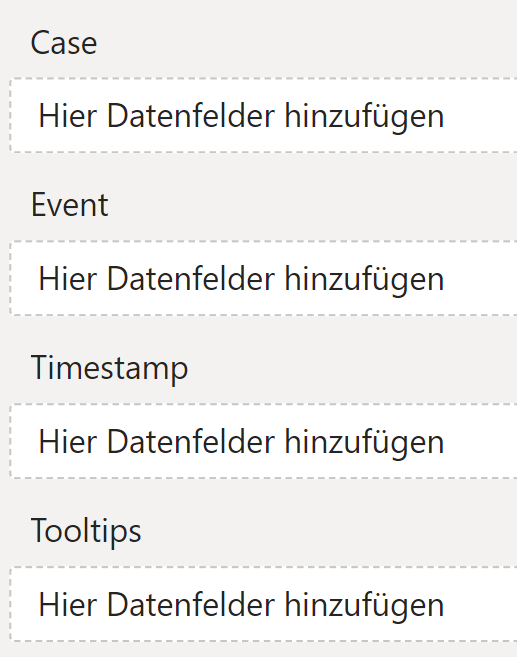
Dropzone
The dropzone allows you to configure the Process Flow visual for your dataset. The most common and also simplest type of dataset that can be analyzed with the Process Flow visual is an event log. An event log structure usually contains a single column for the events that happened. A separate column groups these events into some sort of category and a third column contains a timestamp to denote when the event occurred.
A dataset like this perfectly maps to the expected structure of the visual’s dropzone.
In addition to these three mandatory columns, your dataset may also include some metrics about the event. You can add those fields to the tooltips section of the dropzone and the visual will display this information aggregated for each event on hover.
Case
A case is a category, by which all events are grouped.
All cases that have the same event sequence (for example A -> B -> C) are further grouped into a so called variant, which can be used to select all of them at once.
This dropzone allows for a single field, which can not be a measure. Any datatype is supported, the visual will compare stringified versions of the values to determine equality.
Event
An event is a edge/node in the process graph that will be rendered. All events that belong to the same case build a sequence, ordered by their respective timestamps. This sequence is used to draw the graph.
This dropzone allows for a single field, which can not be a measure. Any datatype is supported, the visual will compare stringified versions of the values to determine equality.
Timestamp
The timestamp is used to order the events in a sequence.
This dropzone allows for a single field, which can not be a measure. The datatype of the field must be datetime.
Tooltips
This dropzone allows for multiple fields, including measures. Any datatype is supported in principle, though some aggregation functions might not work with all datatypes.
Formatting settings
The formatting pane allows you to change various settings for the Process Flow visual, including its behavior, its enabled functionality and its styling.
Flow settings
General settings that control the overall behavior of the Process Flow visual.
Variant zoom
The variant zoom is a feature that allows you to focus only on relevant parts of your process data. Using it you can strip less common variants from the output to reduce the clutter when focusing on the primary flow of your process.
The zoom can be configured to different levels, each keeping only a certain percentile of the variants, based on the number of cases they contain.
Default zoom level
Configures the Variant zoom level that will be used by default whenever the visual is loaded.
The following options are available:
- None (all 100%)
No zoom occurs. All variants will be displayed. - High (top 75%)
Only the top most variants containing a total of 75% of all cases will be displayed. - Middle (top 50%)
Only the top most variants containing a total of 50% of all cases will be displayed. - Low (top 25%)
Only the top most variants containing a total of 25% of all cases will be displayed. - Main
Only the variant with the most occurrences will be displayed.
Events
Settings for configuring the style and formatting of the event boxes rendered in the process graph and their content.
Layout
Layout settings for the event boxes in the process graph.
Event width
Configures the algorithm that should be used to determine the width for each event box.
The following options are available:
- Individual width
Each event box has exactly the width it needs to fit its content. - Max width
Each event boxes has exactly the width required to fit the widest content. All event boxes therefore have the same width.
Box
Settings for the event boxes rendered in the process graph.
Background color
Configures the background color of each event box.
Background transparency (%)
Configures the background transparency (in percent) of each event box.
Border thickness
Configures the border thickness of each event box.
Border color
Configures the color used for the border of each event box.
Label
Settings for the event namen that are displayed inside the event boxes in the process graph.
Text alignment
Configures the position of the event label inside each event box. This setting has no effect if an individual Event width is used.
The available options are the standard alignment options: left, center and right.
Font
Configures the font for the event label inside each event box. The available fonts are provided directly by Power BI and match the ones available for default visuals. Additionally, the font size can also be adjusted and the label can optionally be configured to be bold.
Text color
Configures the color used for the event label text inside each event box.
Count box
Settings for the count boxes rendered inside the event boxes.
Background color
Configures the background color used for the count box. This color is also used for the variant chart and the metrics panel.
Border thickness
Configures the border thickness of each count box.
Border color
Configures the color used for the border of each count box.
Count label
Settings for the count numbers that are displayed inside the count boxes as part of the event boxes in the process graph.
Font
Configures the font for the count number inside each count box. The available fonts are provided directly by Power BI and match the ones available in the default visuals. Additionally, the font size can also be adjusted and the label can optionally be configured to be bold.
Text color
Configures the color used for the count number text inside each count box.
Transition Lines
Settings for configuring the style and formatting of the lines rendered between event boxes in the process graph.
Transition lines have a start and an end event (or they connect an event to the process start/end point) and always have a direction. They indicate the order of events and may optionally have some metrics attached to them, such as the duration.
Line
Settings for the appearance of transition lines.
Line color
Configures the color used for the stroke that connects two event boxes together.
Line width
Configures the thickness of the stroke that connects two event boxes together.
The special values 98 and 99 enable a variable line thickness, highlighting transitions that occur more often (essentially highlighting the top variants).
Start marker
Settings for the appearance of the marker rendered at the start of each transition line.
Enabled
Configures whether the start marker is rendered at all, or not.
Marker color
Configures the color used for the transition line start marker.
Marker size
Configures the size of the transition line start marker.
End Marker
Settings for the appearance of the marker rendered at the start of each transition line.
Enabled
Configures whether the end marker is rendered at all, or not.
Marker color
Configures the color used for the transition line end marker.
Marker size
Configures the size of the transition line end marker.
Transition metrics
Settings for configuring the style, formatting and behavior of the metric boxes rendered on the transition lines between the events in the process graph.
These boxes give additional information about the transition, which can be used for analysis. Currently the metrics are the average transition duration and the total number of occurrences of this transition in the process.
Text
Settings for the text that is displayed inside each metrics box.
Font
Configures the font for the text inside each metrics box. The available fonts are provided directly by Power BI and match the ones available in the default visuals. Additionally, the font size can also be adjusted and the label can optionally be configured to be bold.
Text color
Configures the color used for the text inside each metrics box.
Box
Settings for the metrics box rendered on the lines between the events in the process graph.
Background color
Configures the background color used for the metrics box.
Background transparency (%)
Configures the background transparency (in percent) of each metrics box.
Border thickness
Configures the border thickness of each metrics box.
Border color
Configures the color used for the border of each metrics box.
Count
Settings for the count metric that is displayed in each metrics box.
A transition describes the change of one event to another over time. The count metric equals the total number of occurrences of a specific event change in the whole process.
Enabled
The following options are available:
- On
The count metric is displayed on all transitions. - On (without start/end)
The count metric is displayed on all transitions that are not connected to the process start/end point (i.e. only transitions connecting two actual events together). - Off
The count metric is not displayed.
Title
Configures the title of the count metric, i.e. the text located right before the metric value.
Duration
Settings for the duration metric that is displayed in each metrics box.
A transition’s duration is calculated as the difference between the timestamp of the start event and the timestamp of the end event. The duration metric is the average value of those durations.
Enabled
The following options are available:
- On
The duration metric is displayed on all transitions. - On (without start/end)
The duration metric is displayed on all transitions that are not connected to the process start/end point (i.e. only transitions connecting two actual events together). - Off
The duration metric is not displayed.
Title
Configures the title of the duration metric, i.e. the text located right before the metric value.
Display unit
Configures the time unit to use for the displayed duration value.
Panels
Settings for controlling which panels are enabled in the visual and for their respective configurations.
Panels can enrich the main visualization with additional functionality and/or information, but may not be a fit for every use case.
Minimap
Settings for the minimap panel.
The minimap displays the same events as the process graph, but at a smaller scale. When the main visualization is zoomed into (visually, not logically like the variant zoom) it shows a rectangle that marks the currently visible area. This feature is useful when dealing with large process structures.
Enabled
Configures whether the minimap is shown or not.
Variant chart
Settings for the variant chart.
The variant chart displays a bar chart of all available variants. It is interactive and can be used to quickly filter the shown process data. The selection mechanisms are the same as for Power BI’s default bar chart visual (click for a single selection, ctrl-click to select additional variants).
The color used by the variant chart bars is the same as the count box’s Background color.
Enabled
Configures whether the variant chart is enabled or not.
Variant display count
Configures the number of variants to explicitly show in the variant chart. If the total number of variants exceeds this value, the rest will be combined into a single additional bar called “Rest”.
Metrics
Settings for the metrics panel.
The metrics panel consists of the case, the variant and the event gauge and additionally includes the total average duration of the process. Each of those components can be enabled and configured individually.
The color used by the gauges is the same as the count box’s Background color.
Case gauge
Configures the display mode for the case gauge. The case gauge displays the total number of cases in the process and how many of them are currently selected (in numbers and as percentage).
The following options are available:
- Disabled
The case gauge is not displayed in the metrics panel. - Small
A small case gauge is displayed, taking less space and allowing for a second small metric next to it. - Large
A large case gauge is displayed, with no other metrics next to it.
Variant gauge
Configures the display mode for the variant gauge. The variant gauge displays the total number of variants in the process and how many of them are currently selected (in numbers and as percentage).
The following options are available:
- Disabled
The variant gauge is not displayed in the metrics panel. - Small
A small variant gauge is displayed, taking less space and allowing for a second small metric next to it. - Large
A large variant gauge is displayed, with no other metrics next to it.
Event gauge
Configures the display mode for the event gauge. The event gauge displays the total number of events in the process and how many of them are currently selected (in numbers and as percentage).
The following options are available:
- Disabled
The event gauge is not displayed in the metrics panel. - Small
A small event gauge is displayed, taking less space and allowing for a second small metric next to it. - Large
A large event gauge is displayed, with no other metrics next to it.
Average Duration
Configures the display mode for the average duration. The average duration displays the average lead time of the whole process, as it is currently selected in the process graph.
The following options are available:
- Disabled
The average duration is not displayed in the metrics panel. - Small
The average duration is displayed in a smaller form factor, taking less space and allowing for a second small metric next to it. - Large
The average duration is displayed in a larger form factor, with no other metrics next to it.
Highlighting
Settings for configuring the style and formatting of the event boxes rendered in the process graph and their content.
Selected Events
Configure how event blocks appear when a user selects them in the visual.
Has a toggle switch to enable and disable the formatting card and its effects.
Background color
Sets the background color of the event block in its selected state.
Counter color
Sets the color of the counter element within a selected event block in its selected state.
Border color
Customizes the color of the border stroke for selected events.
Border width
Customizes the width of the border stroke for selected events.
Setting cannot be negative or zero.
Text color
Customizes the color of the event text for selected events.
Counter text color
Customizes the color of the counter text for selected events.
Bold text
Toggle to automatically apply bold formatting to text within selected event blocks.
Transparency of unselected events (%)
Adjusts the transparency of all events not currently selected, allowing the focus to remain on the active selection.
Transparency levels cannot be set more than 80%.
Sync transparency level to unselected components
Enable or disable the synchronization of transparency across all visual elements (Lines, Metrics, and Events).
Quick menu
Settings for controlling which parts of the quick menu are visible to report viewers. The quick menu allows report viewers to change a few selected settings at runtime for their session only. Depending on your use case, this may be desired, or not.
Zoom action buttons
The zoom action buttons allow report viewers to control the Variant zoom, providing quick actions for zooming in and out and for selecting a specific zoom level directly.
When the visual is loaded the Default zoom level is applied. If this setting is disabled, the report viewer can not change the default.
Operating these action buttons whilst editing the visual (i.e. always in Power BI Desktop) will automatically set the default zoom level as well.
Tooltips
Settings for configuring the behavior of each tooltip individually. This settings group is disabled, if the tooltips dropzone is empty.
Apply settings to
All other options in this settings group apply to the currently selected tooltip only. This allows you to configure each tooltip individually.
Tooltip
This dropdown menu allows you to select the tooltip you want to configure. The available options will correspond to the fields added to the tooltips dropzone.
General
Settings for configuring general tooltip behavior.
Tooltip position
Configures the location where the tooltip should be shown.
The following options are available:
- Event
Displays the tooltip data on each event in the flow graph. - None
Disables the tooltip.
Processing
Settings for configuring tooltip processing. Since tooltips need to be aggregated, the visual needs to process their data before displaying them.
Aggregation calculation
Configures the type of aggregation that should be performed.
The following options are available:
- SUM
Compute the sum of all values. - AVG
Compute the average of all values. - MIN
Compare all values and show only the minimum. - MAX
Compare all values and show only the maximum. - First
Show only the first value. - Last
Show only the last value.
Advanced
Settings intended for advanced use cases. Please make sure their implications, drawbacks and shortcomings are thoroughly understood before enabling them.
Some of the settings in this category can cause severe problems, such as making Power BI unresponsive in certain scenarios. These settings are marked with a “⚠”, please be extra careful when using them.
⚠ Visual interactions
Configures whether selections in the Process Flow visual interact with other visualizations in your report using Power BI’s visual interactions feature (usually through highlighting or filtering). With this feature enabled, selecting a variant in the variant chart or an event in the process graph will affect other visuals, similar to how selecting something in a default bar chart affects other visuals.
⚠ Attention: using this feature with anything but trivially small datasets (~50 cases with ~10 events each) WILL make Power BI unresponsive.
This happens because, in contrast to e.g. a default bar chart, the categories (i.e. variants) selectable in the Process Flow visual do not actually exist in your dataset, instead they are computed on demand. To select a complete variant the visual therefore needs to tell Power BI individually about every single data row that makes up this variant. This can quickly ramp up to hundreds or thousands of rows, quantities which Power BI’s visual interaction feature was not designed for.
This feature is available for use cases where the dataset is known to be small, as it provides a great user experience in those scenarios.
License
Information about the currently active license.
The visual includes an advanced licensing implementation, allowing it to work with both Microsoft AppSource plans, as well as custom license keys issued directly by SCvation GmbH. Additionally, the visual can be used free of charge, under the constraints of the free tier restrictions.
License type
Displays the type of the currently active license, as well as the progress when activating a new custom license.
The following license types are possible:
- Free
This license type is displayed if no license is available, i.e. no AppSource license has been assigned to your Microsoft/Power BI user and the visual has not been activated with a custom license key. All restrictions of the free tier apply for this license type. - AppSource License Plan
This license type is displayed if your Microsoft/Power BI user has an assigned AppSource license for the visual. After purchasing a plan on AppSource, the licenses need to be assigned in the Microsoft 365 Admin Center. Please note that because this license type is bound to the currently logged in user, it does not guarantee that all report viewers will have a valid license as well. Report viewers that do not have an AppSource license assigned will be subject to all restrictions of the free tier as well. - Licensee Custom License
This license type is displayed if a SCvation provided license key was used to activate the visual, and the license key has not yet expired. Licensee will usually be your company’s name. This license type guarantees that all report viewers can use the visual without restrictions, as the license is bound to the visual instance itself and not to specific users.
Additionally, you may encounter the following messages in this text field, when trying to activate the visual using a custom license key:
- Validating…
This message is displayed if the visual is currently validating the custom license key. If the validation succeeds, the correct license type (see above) will be shown again and the expiry date will be adjusted. Should there be a problem with the validation, one of the below error messages will be displayed instead. No internet access is required to validate a custom license key. - Expired
This error message is displayed if the stored custom license key expired. This can either happen when trying to validate an already expired key, or if a previously valid key has since expired. This error message is permanent and will only go away by validating a different custom license key. If a custom license key expires, the visual will still work, although under the restrictions of the free tier. - Invalid License Key
This error message is displayed if the given text is not a valid license key. After a few seconds the correct license type (see above) type will be shown again. - Invalid Product
This error message is displayed if the given text is a valid custom license key, but for the wrong SCvation product. After a few seconds the correct license type (see above) will be shown again.
License expiry date
If the visual is activated via a license key from SCvation GmbH, you will find the date on which the license expires here.
License key input
License keys purchased from SCvation GmbH can be imported here to activate the visual and remove the free tier restrictions.
Free tier restrictions
For more information, please see pricing.
The visual itself can be downloaded for free from Microsoft AppSource. If the visual is used without a valid license it may apply a watermark to the process graph, but most functionality will still be available. For more information please see below.
The visual works this way to ensure everyone can fully test and evaluate the available functionality, before making a purchase.
Licensed features
If the visual found a valid license, all features are fully available without any restrictions.
Otherwise, all settings marked as being a “Licensed feature” (indicated by an asterisk “*” following the setting’s name in the formatting pane) will apply a watermark, if changed. Changing the setting back to its default value will remove the watermark again. This approach allows you to test and evaluate all features the Process Flow visual has to offer before purchasing a license.
Data limits
If the visual found a valid license, all data is fully loaded and available without any restrictions.
Otherwise, the visual will limit the data that is shown and apply a watermark to the process graph. The data limit is triggered if your dataset has more than 250 rows. To ensure you can properly test and evaluate the Process Flow visual even with bigger datasets, your data will not simply be cut off after 250 rows. Instead, the visual will process the data as usual and then only show the three most common variants, additionally scaling their counts down to about 30 cases in total. You can therefore be sure that the process graph rendered by an unlicensed Process Flow visual always matches what you would see if the visual had a license and only the top 3 variants were selected.