
Documentation - Table
Overview Table
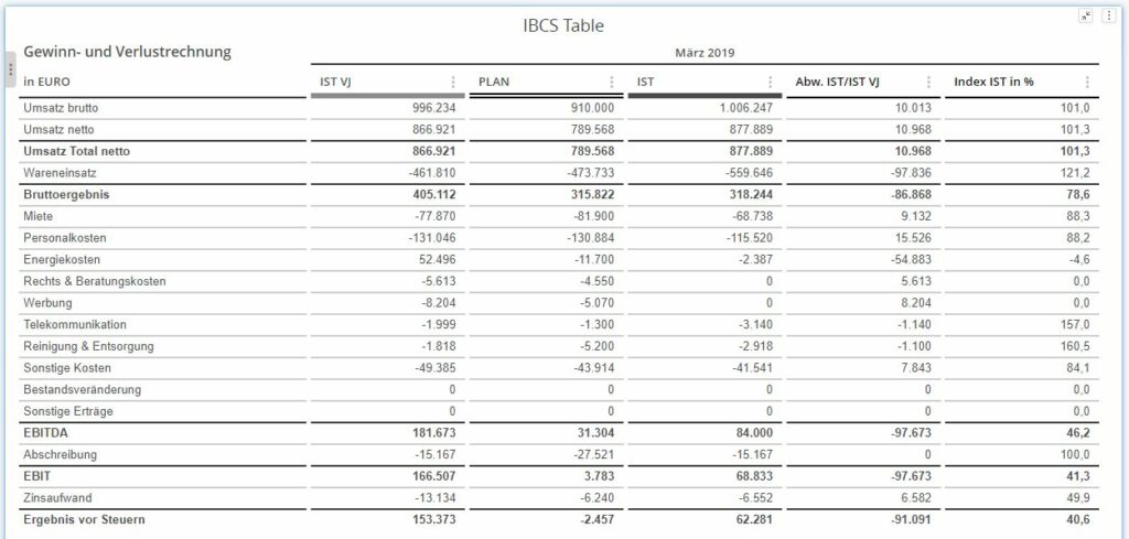
The SCvation Table provides a visual support of data in a tabular form. In particular, forms of an income statement and IBCS-compliant formatting are supported. The tabular representation can be formatted and edited using many items in the menu.
In addition, automatic formatting and formatting according to conditions are also possible.
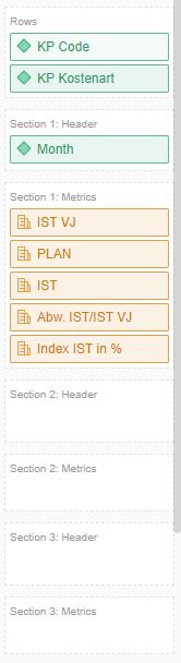
Drop Zone
- Rows
- 6 x Attribute
- Do the rows/categories contain information
- Section 1: Header
- 1 x Attribute
- Attribute content determines the section heading
- However, only one content can be displayed
- Section 1: Metrics
- ∞ x Metrics
- Contains the numerical values for the first section.
- Number of the metric defines the number of columns
- Metric Name defines the column heading
- Section 2-7: Header
- Similar to section 1, further sections can be built up.
- Section 2-7: Metrics
- The sections, which are structured in the same way as Section 1, can also define their columns by dragging in metrics
Options-Menü
Menü einblenden
Pressing this button opens the SCvation menu.
Various settings and formatting of the visualization can be changed with the menu.
General
General > General
General settings for tables, display of visualization blocks and number formatting are made in the options menu General > General.
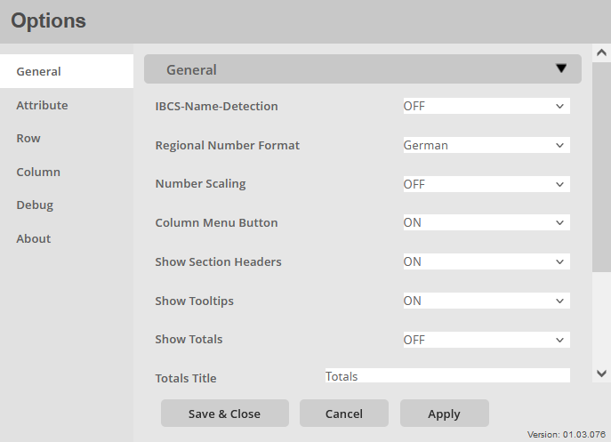
IBCS-Name Detection:
Enable/disable automatic recognition of IBCS formats based on metric names.
- ON
- Automatic IBCS detection is activated
- OFF
- Automatic IBCS detection is not activated.
If a metric is recognized based on its name, the associated columns are automatically formatted with the specified formatting behind the respective name.
Regional Number Format:
Option to assign the regional number format to the visualization. In particular, this is about the representation of the comma and the thousands separator. A distinction is made between German and English format.
- German
- Thousand separators: “.”
- Decimal place: “,”
- English
- Thousand separators: “,“
- Decimal place: “.“
Number Scaling:
Option to break down the numbers of the visualization.
- OFF
- Tausend [K]
- Millionen [M]
- Billionen [G]
In this format, the payers are taken over for the visualization and taken over for the calculations and representations.
Column Menu Button:
Activate/deactivate the menu switches in the columns headings: ON / OFF
Show Section Headers:
Enable/disable section headings: ON / OFF
Show Tooltips:
Activate/deactivate the additional information: ON / OFF
Show Totals:
Enable/disable calculation and display of totals: ON / OFF
Totals Title:
Definition of a display name of the sum
- Text input field
- Enter a name for the merged group. This is taken unformatted from the text field.
Width Scaling:
Activate/deactivate the automatic scaling of the table to the width: ON / OFF
General > Title
Specific settings for the title of the visualization are made in the options menu General > Title.
Show Title:
Activate/deactivate the display of the title: ON / OFF
Maintitle:
Assignment of an additional main title, which is also displayed in the visualization.
- Text input field
- Enter the title in the text field, this will be accepted unformatted.
Font Family:
Setting the fonts of the main title.
There is a large selection of different fonts, including:
- Arial
- Open Sans
- Segoe UI
Font Size:
Setting the font size for the title, there is a choice of font sizes:
- 6pt-14pt
Font Weight:
Setting the font weight for the title, choice between:
- Normal
- Bold
Font Color:
Setting the font color for the title.
Color selection:
- Color menu:
- The color can be selected using buttons.
- The colors of the buttons are predefined and can be customized for the specific company.
- Using the text field in the color menu, additional colors can be added using a hex code.
Show Subtitle:
Activate/deactivate the display of the subtitle: ON / OFF
Subtitle:
Assignment of an additional second title, which is also displayed in the visualization.
- Text input field
- Enter the title in the text field, this will be accepted unformatted.
Font Family:
Setting the fonts of the second title.
There is a large selection of different fonts, including:
- Arial
- Open Sans
- Segoe UI
Font Size:
Setting the font size for the title, there is a choice of font sizes:
- 6pt-14pt
Font Weight:
Setting the font weight for the title, choice between:
- Normal
- Bold
Font Color:
Setting the font color for the title.
Color selection:
- Color menu:
- The color can be selected using buttons.
- The colors of the buttons are predefined and can be customized for the specific company.
- Using the text field in the color menu, additional colors can be added using a hex code.
Background Color:
Set a background color for the rows.
Color selection:
- Color menu:
- The color can be selected using buttons.
- The colors of the buttons are predefined and can be customized for the specific company.
- Using the text field in the color menu, additional colors can be added using a hex code.
Background Color Opacity:
Setting the opacity/chroma of the background enabled for the rows: 10% – 100%
General > Advanced
In the General > Advanced options menu, specific settings are made for checking predefined company variables.
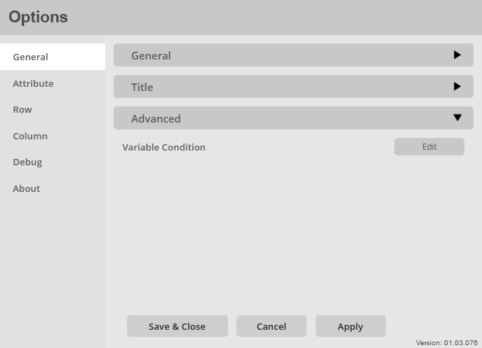
Variable Condition:
Setting a condition based on a variable in the config file:
- Attribute selector
- Selection of the attribute to be used for comparison with the variables
- Variable selector
- Selection of the variable object that was defined by the administrator or when the visualization was delivered in the config file
Attribute
Select Attribute:
Selection of all attributes available in a drop zone.
Selecting the attribute for which the following general settings are to be made.
Attribute > Display Attribute
Specific settings for the display of attributes are made in the Attributes > Display Attribute options menu.
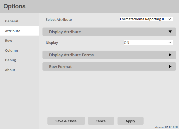
Display:
Activate/deactivate the display of the attribute in the table: ON / OFF
Attribute > Display Attribute Forms
Specific settings for the display of attribute forms are made in the Attributes > Display Attribute Forms options menu.
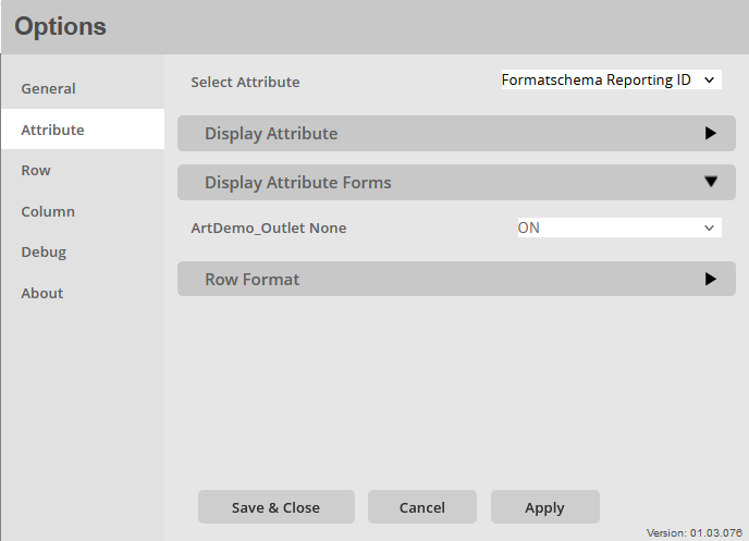
Display Attribute Forms:
List of all forms of the selected attribute
Enable Disable display of attributes From: ON / OFF
At least one of these attribute forms must be activated!
Attribute > Row Format
Specific settings for the selection of the row format are made in the Attributes > Row Format option menu.
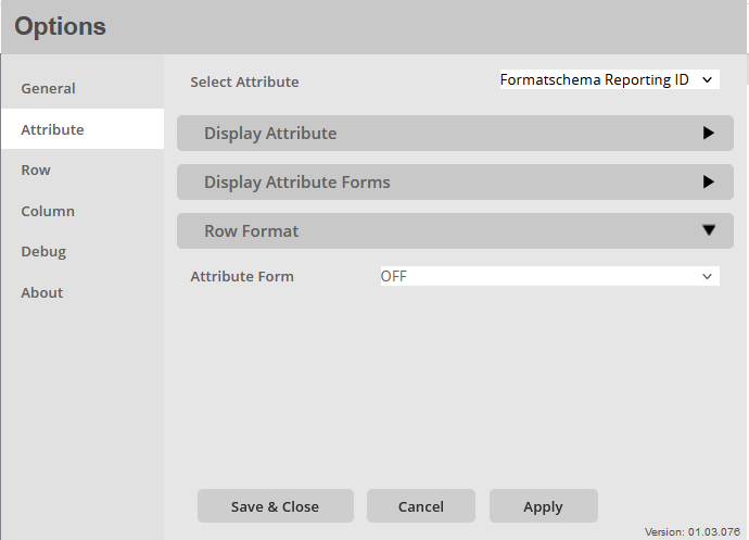
Row Format:
Listing of all existing attribute forms from each drop zone.
Setting the form attributes which can then be used for line formatting.
To accept this setting, the menu must be closed and reopened.
The selection is independent of the selected attribute!
Row Options
Select Format:
Shows the content of those form attributes specified as Row Format.
Selection of the line for which the following settings are to be made.
Row > General
General settings for the formatting of the rows are made in the options menu Row > General.
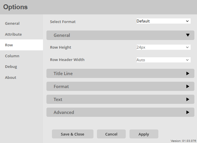
Row Height:
Set a general row height for the rows: 10px – 40px in 2px steps.
Row Header Width:
Set a general height for the row labels:
- Auto
- The line height is generated automatically based on the text
- 20px-400px in 20px steps
Row > Title Line
In the Options menu Row > Title Line general settings for the formatting of the title line are made.
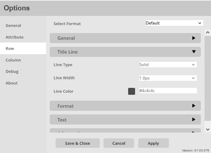
Line Type:
Setting to define the appearance of the title line.
- Solid
- Dashed
Line Width:
Setting to define the width of the line. The following options are available:
- OFF
- 0.1px – 8px (1px – 8px in Firefox)
Line Color:
Setting to define the color of the title line.
Color selection:
- Color menu:
- The color can be selected using buttons.
- The colors of the buttons are predefined and can be customized for the specific company.
- Using the text field in the color menu, additional colors can be added using a hex code.
Row > Format
In the options menu Row > Format specific settings for the formatting of the rows are made.
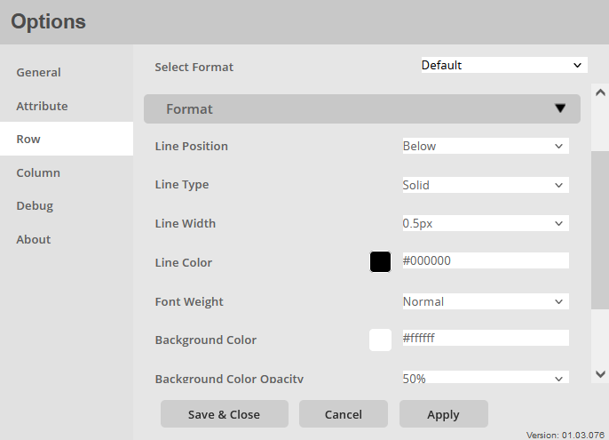
Line Position:
Selection of the line position for the selected line:
- Above
- The line appears above the line
- Below
- The line appears below the row
- Above and Below
- The line appears above and below the line
Line Type:
Selection of the line type for the selected line:
- Dashed
- Solid
Line Width:
Setting the line thickness of the lines.
Choice for formatting:
- OFF
- 0.1px – 8px (1px – 8px in Firefox)
Line Color:
Setting to determine the line color.
Color selection:
- Color menu:
- The color can be selected using buttons.
- The colors of the buttons are predefined and can be customized for the specific company.
- Using the text field in the color menu, additional colors can be added using a hex code.
Font Weight:
Setting the font weight for the text lines.
Choice between:
- Normal
- Bold
Background Color:
Set a background color for the rows.
Color selection:
- Color menu:
- The color can be selected using buttons.
- The colors of the buttons are predefined and can be customized for the specific company.
- Using the text field in the color menu, additional colors can be added using a hex code.
Background Color Opacity:
Setting the opacity/chroma of the background enabled for the rows: 10% – 100%
Row > Text
Specific settings for the formatting of the text rows are made in the options menu Row > Text.
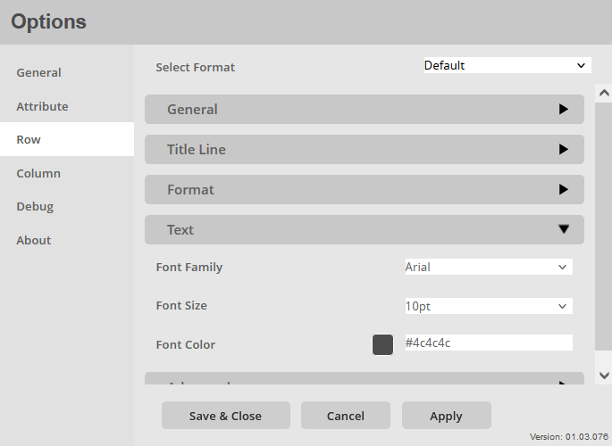
Font Family:
Setting the fonts of the text lines.
There is a large selection of different fonts, including:
- Arial
- Open Sans
- Segoe UI
Font Size:
Setting the font size for the lines of text, a selection of font sizes is specified:
- 6pt-12pt
Font Color:
Setting the font color for the text lines.
Color selection:
- Color menu:
- The color can be selected using buttons.
- The colors of the buttons are predefined and can be customized for the specific company.
- Using the text field in the color menu, additional colors can be added using a hex code.
Row > Advanced
In the options menu Row > Advanced specific settings for the display of the rest are made.
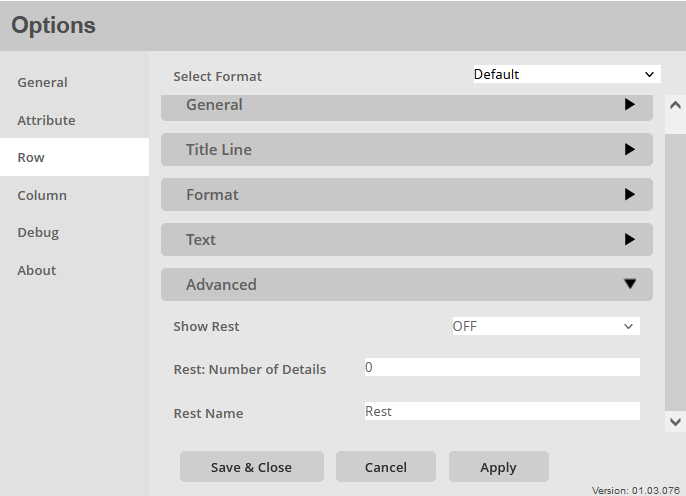
Show Rest:
Activate/deactivate the detail view: ON / OFF
By activating, a number of lines, which is defined in the next menu item, are displayed as details, all other lines are summarized as the remainder and added as a group at the end.
Rest: Number of Details:
Definition of the number of rows to be displayed in detail.
- Text input field
- Enter a number in the text field, this determines the number of bars that are displayed as a detail.
Rest Name:
Define a display name that names the summarized group
- Text input field
- Enter a name for the merged group. This is taken unformatted from the text field.
Column
Select a Section/Metric:
Selector for selecting the section in which the column formatting for the subsequently selected metric should be carried out.
Selector to choose the metric for which the following column formatting should be done.
It should be noted here that the correct section and the correct metric/column must be selected.
Column > General
General settings for the columns are made in the options menu Column > General.
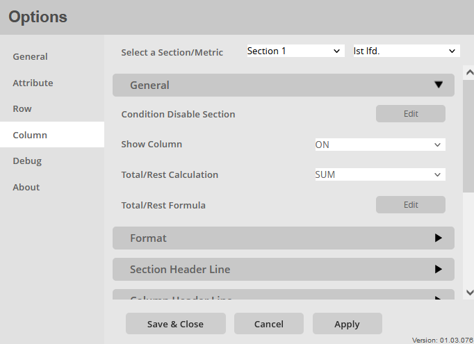
Condition Disable Section:
Set a condition to hide the entire section:
- Attribute selector
- Selection of the attribute whose data/content is to be compared
- Comparison operator selector
- ==
- !=
- IN
- NOT IN
- Value input
- Eingabe einer Zahl/eines Textes mit der Verglichen werden soll.
Show Column:
Enable/disable display of this column: ON / OFF
Total/Rest Calculation:
Setting to determine the aggregate function for the Total and Remainder calculation.
Total/Rest formular:
Setting to determine the formula for the Total/Rest calculation itself:
- Metric 1
- Operator selection
- Metric 2
Column > Format
In the options menu Column > Format specific settings for the column formatting are made.
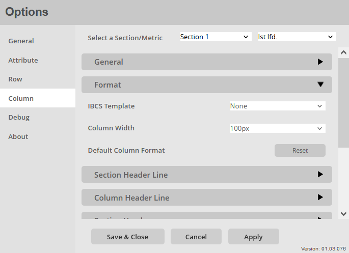
IBCS Template:
An IBCS format can be assigned to the selected column, according to which this column is to be formatted. This option can already be set by the automatic detection in the General > General menu.
Column Width:
Setting a column width. This is automatically set to a value at the beginning and can then be changed individually for each column: 20px – 300px in 10px and 20px steps.
Default Column Format:
Switch to reset the column format to the initial values. The following settings will be reset to their default value:
- Format
- IBCS Template
- Column Width
- Column Header Line
- Line Width
- Line Color
- Line Type
- Column Header
- Font Family
- Font Size
- Font Weight
- Font Color
- Alignment
- Background Color
- Background Color Opacity
- Value Format
- Value Type
- Symbole Position
- Decimal Places
- Alignment
- Micro Chart
- Show Micro Chart
- Color Positive
- Color Negative
- Show Axis
- Offset
- Cut off
- Cut off percentile
- Conditional Formating Traffic Light
- Color 1
- Symbol 1
- Color 2
- Symbol 2
- Color 3
- Symbol 3
- Color 4
- Symbol 4
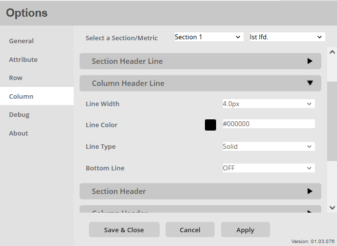
Column > Section Header Line
In the Options menu Column > Section Header Line specific settings for section header line formatting are made.
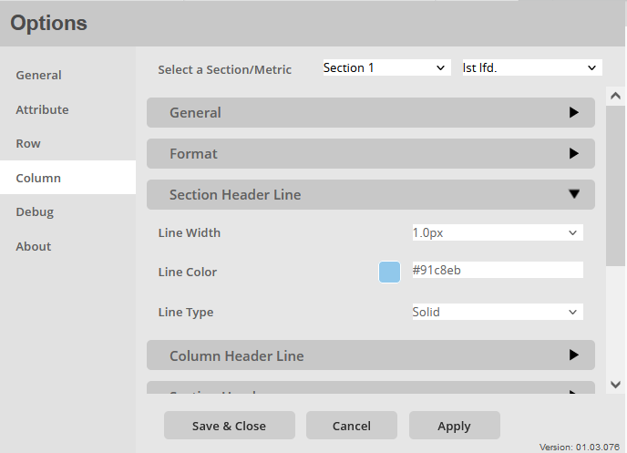
Line Width:
Set the line width for the section header.
Width selection:
- OFF
- 0.1px – 8px (1px – 8px in Firefox)
Line Color:
Set the line color for the section header.
Color selection:
- Color menu:
- The color can be selected using buttons.
- The colors of the buttons are predefined and can be customized for the specific company.
- Using the text field in the color menu, additional colors can be added using a hex code.
Line Type:
Set the style of the section header line.
Line type options:
- Solid
- Dashed
Column > Column Header Line
In the Options menu Column > Format specific settings for the column formatting are made.
- Line Width:
Set the line width for the column header.
Width selection: - OFF
- 0.1px – 8px (1px – 8px in Firefox)
Line Color:
Set the line color for the column header.
Color selection:
- Color menu:
- The color can be selected using buttons.
- The colors of the buttons are predefined and can be customized for the specific company.
- Using the text field in the color menu, additional colors can be added using a hex code.
Line Type:
Set the style of the section header line.
Line type options:
- Solid
- Dashed
- Dashed (diagonal)
- Dashed (diagonal, fine)
- Double
Bottom Line:
Setting whether to display a line below the column. ON / OFF
Column Options > Section Header
In the options menu Column Options > Section Header specific settings are made for the formatting Sections Headings.
Header Text:
Enter a section title if no title is given by the drop zone.
Font Family:
Setting the fonts of the section heading.
There is a large selection of different fonts, including:
- Arial
- Open Sans
- Segoe UI
Font Size:
Setting the font size for the section heading. A selection of font sizes is preset:
- 6pt-14pt
Font Weight:
Setting the font weight for the section heading.
Choice between:
- Normal
- Bold
Font Color:
Setting the font color for the section heading.
Color selection:
- Color menu:
- The color can be selected using buttons.
- The colors of the buttons are predefined and can be customized for the specific company.
- Using the text field in the color menu, additional colors can be added using a hex code.
Alignment:
Setting to determine the horizontal position of the header. The following options are available:
- Left
- Center
- Right
Set for all Section:
Switch to apply these settings to all sections.
Background Color:
Setting to define the background color of the section header.
Color selection:
- Color menu:
- The color can be selected using buttons.
- The colors of the buttons are predefined and can be customized for the specific company.
- Using the text field in the color menu, additional colors can be added using a hex code.
Background Color Opacity:
Define the opacity of the background. Values from 0% to 100% in 10% steps are available.
Column > Column Header
In the options menu Column > Column Header specific settings for formatting column headers are made.
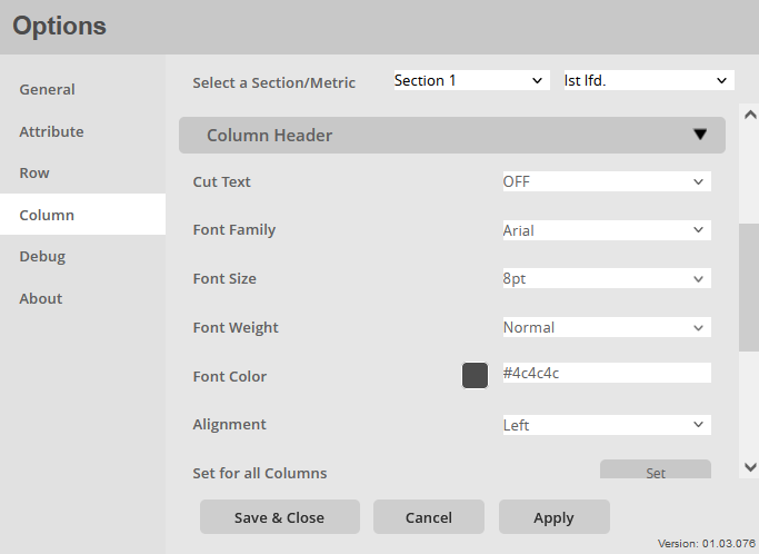
Cut Text:
Setting to truncate column headings if they are larger than the column width: ON / OFF
Font Name:
Setting the fonts for the column headings.
There is a large selection of different fonts, including:
- Arial
- Open Sans
- Segoe UI
Font Size:
Setting the font size for the column heading, a selection of font sizes is specified:
- 6pt-14pt
Font Weight:
Setting the font weight for the column headings.
Choice between:
- Normal
- Bold
Font Color:
Setting the font color for the column heading.
Color selection:
- Color menu:
- The color can be selected using buttons.
- The colors of the buttons are predefined and can be customized for the specific company.
- Using the text field in the color menu, additional colors can be added using a hex code.
Alignment:
Setting to determine the horizontal position of the header. The following options are available:
- Left
- Center
- Right
Set for all Columns:
Switch to apply these settings to all columns.
Background Color:
Setting to define the background color of the section header.
Color selection:
- Color menu:
- The color can be selected using buttons.
- The colors of the buttons are predefined and can be customized for the specific company.
- Using the text field in the color menu, additional colors can be added using a hex code.
Background Color Opacity:
Define the opacity of the background. Values from 0% to 100% in 10% steps are available.
Column > Value Format
In the options menu Column > Value Format specific settings for the formatting of the numbers in the columns are made.
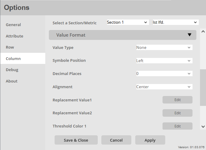
Value Type:
Selection of the number type for this column:
- NONE
- The number does not get an additional symbol
- €
- The number also receives the euro symbol
- $
- The number also gets the dollar symbol
- %
- The number also gets the percent symbol
- MicroStrategy Default
- The number also receives the symbol that is supplied by MicroStrategy or was imported from the data
Symbol Position:
Setting for the position of the selected symbol for the number:
- Left
- The symbol is displayed in front of the number
- Right
- The symbol appears after the number
Decimals Places:
Set the number of decimal places for the numbers in this column.
selection: 0 – 5
Replacement Value 1:
Set a condition to replace the numbers in this column with text or another number
- Metrik selector
- Selection of the metric whose data is to be compared
- Comparison operator selector
- <
- >
- ==
- !=
- <=
- >=
- Value input
- Enter a number to compare with.
- Replacement input
- Enter a number, text, or symbol to replace the number in the column.
Replacement Value 2:
Set a condition to replace the numbers in this column with text or another number
- Metrik selector
- Selection of the metric whose data is to be compared
- Comparison operator selector
- <
- >
- ==
- !=
- <=
- >=
- Value input
- Enter a number to compare with.
- Replacement input
- Enter a number, text, or symbol to replace the number in the column.
Threshold Color 1:
Set a condition whereby the font color of the number in the column should be changed.
- Metrik selector
- Selection of the metric whose data is to be compared
- Comparison operator selector
- <
- >
- ==
- !=
- <=
- >=
- Value input
- Enter a number to compare with.
- Parameter selector
- Selection of which parameters are to be changed Selection:
- Text Color
- Selection of which parameters are to be changed Selection:
- Color Picker
- Selection of the color to be used if the condition is met
- Color menu:
- The color can be selected using buttons.
- The colors of the buttons are predefined and can be customized for the specific company.
- Using the text field in the color menu, additional colors can be added using a hex code.
- Color menu:
- Selection of the color to be used if the condition is met
Threshold Color 2:
Set a condition whereby the font color of the number in the column should be changed.
- Metrik selector
- Selection of the metric whose data is to be compared
- Comparison operator selector
- <
- >
- ==
- !=
- <=
- >=
- Value input
- Enter a number to compare with.
- Parameter selector
- Selection of which parameters are to be changed Selection:
- Text Color
- Selection of which parameters are to be changed Selection:
- Color Picker
- Selection of the color to be used if the condition is met
- Color menu:
- The color can be selected using buttons.
- The colors of the buttons are predefined and can be customized for the specific company.
- Using the text field in the color menu, additional colors can be added using a hex code.
- Color menu:
- Selection of the color to be used if the condition is met
Column > Micro Chart
In the options menu Column > Micro Chart specific settings for the formatting and the use of micro charts are made.
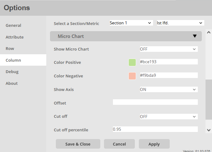
Show Micro Charts:
Activate/deactivate the micro charts.
A micro chart type position to be displayed instead of numbers.
- OFF
- This column is not displayed as a micro chart
- Bar
- This column is displayed as a micro chart using bars.
- Needle
- This column is represented by needles as a micro chart.
- Traffic Light
- This column is displayed as a micro chart using a traffic light. Which defines the traffic light through the next menu item.
Color Positive:
Setting a signal color for the positive direction of the micro charts.
Color selection:
- Color menu:
- The color can be selected using buttons.
- The colors of the buttons are predefined and can be customized for the specific company.
- Using the text field in the color menu, additional colors can be added using a hex code.
Color Negative:
Setting a signal color for the negative direction of the micro charts.
Color selection:
- Color menu:
- The color can be selected using buttons.
- The colors of the buttons are predefined and can be customized for the specific company.
- Using the text field in the color menu, additional colors can be added using a hex code.
Show Axis:
Activate/deactivate the display of the X-axis in the micro charts: ON / OFF
Offset:
Setting for shifting the X-axis of the micro charts in one direction.
- Text input field
- Enter a number, which is then subtracted from the metric value
Cut off:
Enable/disable clipping of values that are too large: ON / OFF
This clipping is based on a percentile defined in the following menu item.
Cut off percentile:
Setting the percentile that defines the clipping
- Text input field
- Enter a number, which should be a number less than 1
- Ex.: 0.95
Percentile:
If you enter 0.95, 95% of the bars/needles will be displayed completely and the remaining 5% will be cut off.
Column > Conditional Formatting Traffic Light
In the options menu Column > Conditional Formatting Traffic Light specific settings for setting conditions and formatting for the structure of the traffic light are made.
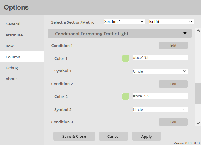
Condition 1:
Setting the condition for the first traffic light signal:
- Metrik selector
- Selection of the metric whose data is to be compared
- Comparison operator selector
- <
- >
- ==
- !=
- <=
- >=
- Value input
- Enter a number to compare with.
Color 1:
Setting a fill color of the first traffic light signal.
Color selection:
- Color menu:
- The color can be selected using buttons.
- The colors of the buttons are predefined and can be customized for the specific company.
- Using the text field in the color menu, additional colors can be added using a hex code.
Symbol 1:
Selection of the symbol which should represent the first traffic light signal.
- Circle
- Rectangle
- Triangle
- Hook
- Diamond (Unicode)
- Diamond (D3)
Condition 2:
Setting the condition for the second traffic light signal:
- Metrik selector
- Selection of the metric whose data is to be compared
- Comparison operator selector
- <
- >
- ==
- !=
- <=
- >=
- Value input
- Enter a number to compare with.
Color 2:
Setting a fill color of the second traffic light signal.
Color selection:
- Color menu:
- The color can be selected using buttons.
- The colors of the buttons are predefined and can be customized for the specific company.
- Using the text field in the color menu, additional colors can be added using a hex code.
Symbol 2:
Selection of the symbol which should represent the second traffic light signal.
- Circle
- Rectangle
- Triangle
- Hook
- Diamond (Unicode)
- Diamond (D3)
Condition 3:
Set the condition for the third traffic light signal:
- Metrik selector
- Selection of the metric whose data is to be compared
- Comparison operator selector
- <
- >
- ==
- !=
- <=
- >=
- Value input
- Enter a number to compare with.
Color 3:
Setting a fill color of the third traffic light signal.
Color selection:
- Color menu:
- The color can be selected using buttons.
- The colors of the buttons are predefined and can be customized for the specific company.
- Using the text field in the color menu, additional colors can be added using a hex code.
Symbol 3:
Selection of the symbol which should represent the third traffic light signal.
- Circle
- Rectangle
- Triangle
- Hook
- Diamond (Unicode)
- Diamond (D3)
Condition 4:
Setting the condition for the fourth traffic light signal:
- Metrik selector
- Selection of the metric whose data is to be compared
- Comparison operator selector
- <
- >
- ==
- !=
- <=
- >=
- Value input
- Enter a number to compare with.
Color 4:
Setting a fill color of the fourth traffic light signal.
Color selection:
- Color menu:
- The color can be selected using buttons.
- The colors of the buttons are predefined and can be customized for the specific company.
- Using the text field in the color menu, additional colors can be added using a hex code.
Symbol 4:
Selection of the symbol which should represent the fourth traffic light signal.
- Circle
- Rectangle
- Triangle
- Hook
- Diamond (Unicode)
- Diamond (D3)
Company Parameters
The Table visual provides six configurable company parameters. These parameters allow each company to tailor the visualization to their specific needs. Once configured, these settings will determine the default formatting of the visual every time a new one is created. This ensures consistency and alignment with the company’s preferences and branding guidelines.
The six configurable parameters are:
- Default font
- Default color positive
- Default color negative
- Color palette (text, bars, lines, etc.)
- Signal color palette (deviations, microcharts)
- Font palette
How to configure?
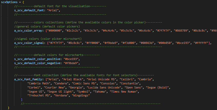
The company parameters can be configured in the configuration file of the visual. This configuration file is located in the visual source folder (…./<visual name>/javascript/). The name of the configuration file is “TableConfig.js“
In the top of the file there is an object called “scvOptions”. Within this object there are the 6 paremeters. The name of the parameters are listed below:
|
Parameter
|
Variable Name
|
|---|---|
|
Default font
|
s_scv_default_font
|
|
Default color positive
|
s_scv_default_color_positive
|
|
Default color negative
|
s_scv_default_color_negative
|
|
Color palette
|
a_scv_color_array
|
|
Signal color palette
|
a_scv_color_signal
|
|
Font palette
|
a_scv_font_family
|
Parameters
Default Font
Configuration file: TableConfig.js
Object name: scvOptions
Name in the configuration file: s_scv_default_font
This parameter controls which font is used by default in the visual. It affects the following areas of the visual:
- Title/Subtitle
- Section header
- Column header
- IBCS presets column header
- Row text
- Menu
- Debug window
- “Arial”,
- “Arial Black”
- “Arial Unicode MS”
- “Calibri”
- “Cambria”
- “Cambria Math”
- “Candara”
- “Comic Sans MS”
- “Consolas”
- “Constantia”,
- “Corbel”
- “Courier New”
- “Georgia”
- “Lucida Sans Unicode”
- “Open Sans”
- “Segoe (Bold)”
- “Segoe UI”
- “Segoe UI light”
- “Symbol”
- “Tahoma”
- “Times New Roman”
- “Trebuchet MS”
- “Verdana”
- “Wingdings”
- etc.
Default Color Positiv
Configuration file: TableConfig.js
Object name: scvOptions
Name in the configuration file: s_scv_default_color_positive
This parameter controls which color is used by default in the visual for positive values. It affects the following areas of the visual:
- Micro Charts (positive values)
- Red: “#FF0000”
- Green: “#00FF00”
- Blue: “#0000FF”
Default Color Negative
Configuration file: TableConfig.js
Object name: scvOptions
Name in the configuration file: s_scv_default_color_positive
This parameter controls which color is used by default in the visual for negative values. It affects the following areas of the visual:
- Micro Charts (negative values)
- Red: “#FF0000”
- Green: “#00FF00”
- Blue: “#0000FF”
Color Palette
Configuration file: TableConfig.js
Object name: scvOptions
Name in the configuration file: a_scv_color_array
This parameter controls which colors are available in the color pickers of the menu. It affects the following areas of the visual:
- Title/Subtitle color
- Title/Subtitle background color
- Row title line color
- Row line color
- Row background color
- Row text color
- Section header line color
- Section header font color
- Section header background color
- Column header line color
- Column header font color
- Column header background color
- Value threshold color
- Red: “#FF0000”
- Green: “#00FF00”
- Blue: “#0000FF”
Signal Color Palette
Configuration file: TableConfig.js
Object name: scvOptions
Name in the configuration file: a_scv_color_signal
This parameter controls which colors are available in the color pickers of the menu. It affects the following areas of the visual:
- Micro Chart positive color
- Micro Chart negative color
- Micro Chart conditional formatting colors
- Red: “#FF0000”
- Green: “#00FF00”
- Blue: “#0000FF”
Font Palette
Configuration file: TableConfig.js
Object name: scvOptions
Name in the configuration file: a_scv_font_family
This parameter controls which fonts are available in the font selectors of the menu. It affects the following areas of the visual:
- Title/Subtitle font
- Section header font
- Column header font
- Row text font
- “Arial”,
- “Arial Black”
- “Arial Unicode MS”
- “Calibri”
- “Cambria”
- “Cambria Math”
- “Candara”
- “Comic Sans MS”
- “Consolas”
- “Constantia”,
- “Corbel”
- “Courier New”
- “Georgia”
- “Lucida Sans Unicode”
- “Open Sans”
- “Segoe (Bold)”
- “Segoe UI”
- “Segoe UI light”
- “Symbol”
- “Tahoma”
- “Times New Roman”
- “Trebuchet MS”
- “Verdana”
- “Wingdings”
- etc.