
Documentation - Dynamic Icon
Overview
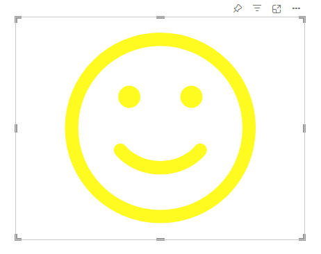
The Dynamic Icon Visual dynamically displays your data using over 1500 customizable icons, transforming data points into powerful visual indicators.
This Custom Visual elevates your data presentation to a new, visually engaging level. Choose from a vast library of 1500 icons and harness the full power of Power BI to display them dynamically and data-driven. Enhance the clarity and aesthetic of your reports with instantly recognizable symbols
Key Benefits:
- Instantly Understandable Data: Replace complex numbers or text with intuitive icons, allowing users to grasp the meaning of your data at a glance
- Massive Library: With over 1000 high-quality icons, you will always find the perfect symbol to represent any KPI, status, or category
- True Power BI Integration: Icons are rendered dynamically based on your data fields, ensuring your visuals always reflect the latest information
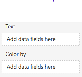
Dropzones
- Text
- 1 x Attribute
- Defines the visible text content
- Color by
- 1 x Attribute
- Defines the dynamic conditions
- Working types: number, string and boolean
Formatting settings
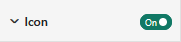
Icon
Show Icon:
Option to show or hide the icon.
The following options are available:
- ON
- The icon is displayed
- OFF
- The icon will not be displayed
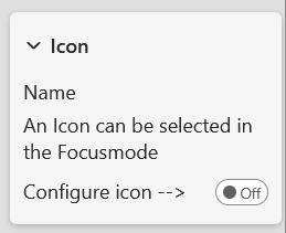
Icon
Icon Name:
Read only text to show which icon is saved.
Configure Icon:
A switch when pressed leads the user to the icon settings.
Color
Color:
Set the icon color using Power BI’s built-in color selector
Choose a color from the Power BI color theme using the color picker buttons. Conditional formatting is available.
Size
Auto Size:
Option to set the icon size. Following options are available:
- ON
- The icon scales automatically with the height and width of the visual
- OFF
- The icon size can manually be scaled by a percentage
Size (%):
The Size can manually be adjusted by percentage (0%-100%).
Dynamic Icons
If Icons is turned off Dynamic Icons gets disabled.
Show Dynamic Icons:
Option to enable or disable Dynamic Icons.
The following options are available:
- ON
- Dynamic Icons is enabled
- OFF
- Dynamic Icons is disabled
Dynamic icons:
A switch when pressed leads the user to the dynamic icons settings.
Shape
Show Shape:
Option to show or hide the Shape.
The following options are available:
- ON
- The Shape is displayed
- OFF
- The Shape will not be displayed
Shape
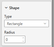
Type:
Choose between different types:
- Rectangle
- Circle
Radius:
This setting is only available for the Rectangle, it allows to set a radius
Color
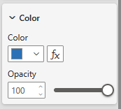
Color:
Set the Shape color using Power BI’s built-in color selector.
- Choose a color from the Power BI color theme using the color picker buttons.
- Conditional formatting is available
Opacity:
This setting lets you control how transparent the shape appears. A value of 0 means the label is fully opaque (non-transparent), while 100 makes it completely transparent.
Border
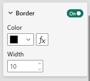
Show Border:
Option to enable or disable the Border. Following options are available:
- ON
- The Border is enabled
- OFF
- The Border is disabled
Color:
Set the Border color using Power BI’s built-in color selector.
- Choose a color from the Power BI color theme using the color picker buttons.
- Conditional formatting is available
Width:
This settings configures the width of the Border.
Text
Show Text:
Option to enable or disable the Text. Following options are available:
- ON
- The Text is enabled
- OFF
- The Text is disabled
Text
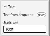
Text from dropzone:
Option to set the text. Following options are available:
- ON
- The Text gets set by the dropzone
- OFF
- The Text gets set by the static text. The default Text is the attributes name from the dropzone.
Static Text:
If Text from Dropzone is disabled, a static Text can be set.
Style
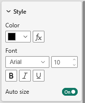
Color:
Set the Text color using Power BI’s built-in color selector.
- Choose a color from the Power BI color theme using the color picker buttons.
- Conditional formatting is available
Font:
Set the font-family of the Text.
There is a large selection of different fonts provided by Power BI.
Font size:
Set the font size for the Text.
A range of font sizes is available to suit different layout needs and preferences.
Font style:
Following options are available:
- Normal
- Bold
- Italic
- Underline
Auto size:
Option to set the Text size. Following options are available:
- ON
- The Text size gets automatically calculated by the width and height of the visual
- OFF
- The Text size can be configured in Font Size
Shadow
Show Shadow:
Option to enable or disable the Shadow. Shadow is only available if Shape is turned on. Following options are available:
- ON
- The Shadow is enabled
- OFF
- The Shadow is disabled
Shadow color 1
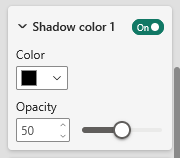
Show shadow color 1:
Option to enable or disable the Shadow color 1. Following options are available:
- ON
- The Shadow color 1 is enabled
- OFF
- The Shadow color 1 is disabled
Color:
Set the Shadow color using Power BI’s built-in color selector.
- Choose a color from the Power BI color theme using the color picker buttons.
Opacity:
The Opacity setting lets you control how transparent the Shadow appears. A value of 0 means the Shadow is fully opaque (non-transparent), while 100 makes it completely transparent.
Shadow color 2
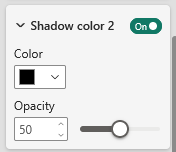
Show shadow color 2:
Option to enable or disable the Shadow color 2. Following options are available:
- ON
- The Shadow color 2 is enabled
- OFF
- The Shadow color 2 is disabled
Color:
Set the Shadow color using Power BI’s built-in color selector.
- Choose a color from the Power BI color theme using the color picker buttons.
Opacity:
The Opacity setting lets you control how transparent the Shadow appears. A value of 0 means the Shadow is fully opaque (non-transparent), while 100 makes it completely transparent.
Shadow settings
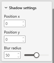
Position x:
This setting sets the x position of the shadow.
Position y:
This settings sets the y position of the shadow.
Blur radius:
This settings sets the blur radius of the shadow.
License
Information about the currently active license.
The visual includes an advanced licensing implementation, allowing it to work with both Microsoft AppSource plans, as well as custom license keys issued directly by SCvation GmbH. Additionally, the visual can be used free of charge, under the constraints of the free tier restrictions.
License type
Displays the type of the currently active license, as well as the progress when activating a new custom license.
The following license types are possible:
- Free
This license type is displayed if no license is available, i.e. no AppSource license has been assigned to your Microsoft/Power BI user and the visual has not been activated with a custom license key. All restrictions of the free tier apply for this license type. - AppSource License Plan
This license type is displayed if your Microsoft/Power BI user has an assigned AppSource license for the visual. After purchasing a plan on AppSource, the licenses need to be assigned in the Microsoft 365 Admin Center. Please note that because this license type is bound to the currently logged in user, it does not guarantee that all report viewers will have a valid license as well. Report viewers that do not have an AppSource license assigned will be subject to all restrictions of the free tier as well. - Licensee Custom License
This license type is displayed if a SCvation provided license key was used to activate the visual, and the license key has not yet expired. Licensee will usually be your company’s name. This license type guarantees that all report viewers can use the visual without restrictions, as the license is bound to the visual instance itself and not to specific users.
Additionally, you may encounter the following messages in this text field, when trying to activate the visual using a custom license key:
- Validating…
This message is displayed if the visual is currently validating the custom license key. If the validation succeeds, the correct license type (see above) will be shown again and the expiry date will be adjusted. Should there be a problem with the validation, one of the below error messages will be displayed instead. No internet access is required to validate a custom license key. - Expired
This error message is displayed if the stored custom license key expired. This can either happen when trying to validate an already expired key, or if a previously valid key has since expired. This error message is permanent and will only go away by validating a different custom license key. If a custom license key expires, the visual will still work, although under the restrictions of the free tier. - Invalid License Key
This error message is displayed if the given text is not a valid license key. After a few seconds the correct license type (see above) type will be shown again. - Invalid Product
This error message is displayed if the given text is a valid custom license key, but for the wrong SCvation product. After a few seconds the correct license type (see above) will be shown again.
License expiry date
If the visual is activated via a license key from SCvation GmbH, you will find the date on which the license expires here.
License key input
License keys purchased from SCvation GmbH can be imported here to activate the visual and remove the free tier restrictions.
Free tier restrictions
Licensed feature
When a valid license is detected, all features of the Dynamic Icon Visual are fully available without restrictions.
Without a license, settings marked as “Licensed Feature” (indicated by an asterisk * in the formatting pane) cannot be modified. Attempting to change these settings will trigger a notification and a watermark within the visual. These indicators are removed automatically when all licensed features are reset to their default values and the data limit has not been exceeded.
This setup enables you to explore and evaluate the full functionality of the Dynamic Icon visualization before purchasing a license.
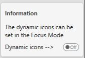
Focus Mode and Menu
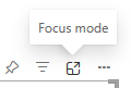
Reading mode:
In Reading Mode, the visual can be displayed in full-screen view, utilizing Focus Mode to minimize distractions and allow users to concentrate entirely on the content.
Edit mode:
In Edit Mode, Focus Mode functions as a menu interface, providing access to editing tools and options for modifying the visual.
Icon
Interface
This screen displays the Icon Selection Interface, which allows users to browse, preview, and select icons for use within the application.
Icon Library
On the left side of the screen, a comprehensive icon library is displayed containing 1,600+ available icons.
Users can quickly locate a specific icon by using the Search icons field at the top of the panel. The icons are presented in a grid layout under the All Icons section, enabling easy browsing and selection.
Icon Preview
The right-side panel shows a Preview of the currently selected icon. This preview allows users to clearly view how the icon will appear before applying it.
Within the preview panel:
The icon style (e.g., emoji-regular) is displayed.
The icon color can be viewed and adjusted using the color selector.
Saving the Selection
After selecting and customizing an icon, users can apply their choice by clicking the Save button at the bottom of the preview panel. This action confirms the icon selection and stores it for use in the visual or component.
Dynamic Icons
This screen displays the Dynamic Icons configuration panel, where users can define rules to dynamically change the icon and its color based on data conditions.
Dynamic icons are controlled through conditions that evaluate the data placed in the Color by drop zone. The available condition options depend on the data type of the field used. Currently, the supported data types are:
Boolean
String
Integer
Each data type provides a set of appropriate comparison conditions that can be used to control the icon behavior.
Condition Table
The center of the interface contains a condition table, where users can define one or more rules. Each row represents a condition with the following settings:
Active – Enables or disables the condition without deleting it.
Order – Defines the priority in which conditions are evaluated.
Field – Displays the data field used for evaluation (for example, Sum of value).
Condition – The comparison operator used to evaluate the data (e.g., is bigger than (>)).
Value – The threshold or value used in the condition.
Icon – The icon that will be displayed when the condition is met.
Color – The color applied to the icon when the condition is satisfied.
Delete – Removes the condition from the list.
Creating New Conditions
Users can create additional rules by clicking the New Condition button in the top-right corner. This allows multiple conditional rules to be configured to control the icon dynamically.
Saving Changes
After configuring the conditions, users must click the Save button to apply and store the dynamic icon settings.