
Documentation - Smart Table
Overview
A high-performance, IBCS-compliant table visual for Power BI featuring advanced hierarchical grouping, dynamic micro-charts, and pixel-perfect rendering for executive-ready reporting.
Unlock professional-grade reporting in Power BI with the Smart Table visual by SCvation. Designed specifically for financial analysts, business controllers, and executive stakeholders, this visual bridges the gap between traditional spreadsheets and interactive business intelligence, offering unparalleled control over data presentation.
Key Benefits:
- IBCS Compliance: Automatically standardize your reports with built-in International Business Communication Standards (IBCS) templates.
- Intelligent Name Detection: Instantly identify data columns based on names (e.g., “Actual”, “Plan”, “Forecast”) and apply standardized IBCS styles.
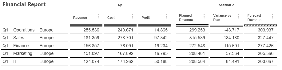
- Dynamic Micro-Chart Visualization: Visualize trends and variances directly within table cells using integrated bars, pins, and symbols.
- Flexible Hierarchies: Multi-level grouping with “Top-N” and “Rest” row aggregation.
- Attribute-Level Custom Styling: Apply specific colors, fonts, and styles to individual values or entire levels of your hierarchy for maximum emphasis.
- Advanced Calculation Engine: Go beyond standard totals with support for Average, Minimum, Maximum, and custom formula-based totals (e.g., Metric A / Metric B).
- Multi-Section Organization: Group your metrics into up to 5 distinct sections, each with independent headers, borders, and formatting rules.
- Enterprise Ready: Optimized for up to 30,000 rows with integrated license management.
Dropzones
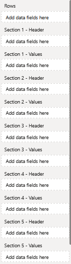
- Rows
- Defines which categories the data will be divided into.
- Section 1 – Header
- 1 x Attribute
- Display text for section 1
- Section 1 – Values
- Contains the values for section 1
- Section 2 – Header
- 1 x Attribute
- Display text for section 2
- Section 2 – Values
- Contains the values for section 2
- Section 3 – Header
- 1 x Attribute
- Display text for section 3
- Section 3 – Values
- Contains the values for section 3
- Section 4 – Header
- 1 x Attribute
- Display text for section 4
- Section 4 – Values
- Contains the values for section 4
- Section 5 – Header
- 1 x Attribute
- Display text for section 5
- Section 5 – Values
- Contains the values for section 5
Formatting settings
Table
General
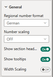
Regional number format:
Decide the regional number format
The following options are available:
- German
- 300000 -> 300.000
- English
- 300000 -> 300,000
Number scaling:
The following options are available:
- OFF
- The Values dont change
- Thousand
- The values get multiplied by 1.000
- Million
- The values get multiplied by 1.000.000
- Billion
- The values get multiplied by 1.000.000.000
Show section headers:
Enables or disables section headers
Show tooltips:
Enables or disables tooltips if hovering over the microchart
Width scaling:
When activated the Table always fits based on the width of the visual
Main title
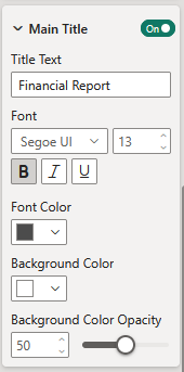
Show main title:
Disable or enable the maintitle
Title:
Maintitle displayname
Font:
Setting of the font.
There is a large selection of different fonts, provided by Power BI.
Font color:
Set the font color using Power BI’s built-in color selector.
Color selection options:
- Choose a color from the Power BI color theme using the color picker buttons.
Background color:
Set the background color using Power BI’s built-in color selector.
Background color opacity:
The opacity setting lets you control how transparent the text appears. A value of 0 means the text is fully opaque (non-transparent), while 100 makes it completely transparent.
Subtitle
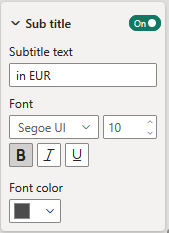
Show subtitle:
Disable or enable the subtitle.
Title:
Subtitle displayname
Font:
Setting of the font.
There is a large selection of different fonts, provided by Power BI.
Font color:
Set the font color using Power BI’s built-in color selector.
Color selection options:
- Choose a color from the Power BI color theme using the color picker buttons.
Totals
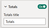
Show totals:
Enable or disable Totals
Title:
Totals displayname
Rest
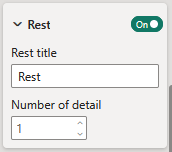
Show rest:
Enable or disable Rest
Title:
Rest displayname
Number of detail:
This option defines how many rows are shown in the table.
Column
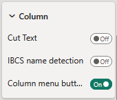
Cut text:
- ON
- The text gets automatically cut if there is no space
- OFF
- The text gets automatically split into multiple rows
IBCS name detection:
If once enabled the the column titles get checked and compared with predefined keywords. If the keywords match as an example “plan” then the column gets the “plan” template. This template can manually be set in the Table Formatting Settings in Column -> Column Format -> IBCS Template
Column menu button:
Enable or disable the menu button in each column header.
License
Information about the currently active license.
The visual includes an advanced licensing implementation, allowing it to work with both Microsoft AppSource plans, as well as custom license keys issued directly by SCvation GmbH. Additionally, the visual can be used free of charge, under the constraints of the free tier restrictions.
License type
Displays the type of the currently active license, as well as the progress when activating a new custom license.
The following license types are possible:
- Free
This license type is displayed if no license is available, i.e. no AppSource license has been assigned to your Microsoft/Power BI user and the visual has not been activated with a custom license key. All restrictions of the free tier apply for this license type. - AppSource License Plan
This license type is displayed if your Microsoft/Power BI user has an assigned AppSource license for the visual. After purchasing a plan on AppSource, the licenses need to be assigned in the Microsoft 365 Admin Center. Please note that because this license type is bound to the currently logged in user, it does not guarantee that all report viewers will have a valid license as well. Report viewers that do not have an AppSource license assigned will be subject to all restrictions of the free tier as well. - Licensee Custom License
This license type is displayed if a SCvation provided license key was used to activate the visual, and the license key has not yet expired. Licensee will usually be your company’s name. This license type guarantees that all report viewers can use the visual without restrictions, as the license is bound to the visual instance itself and not to specific users.
Additionally, you may encounter the following messages in this text field, when trying to activate the visual using a custom license key:
- Validating…
This message is displayed if the visual is currently validating the custom license key. If the validation succeeds, the correct license type (see above) will be shown again and the expiry date will be adjusted. Should there be a problem with the validation, one of the below error messages will be displayed instead. No internet access is required to validate a custom license key. - Expired
This error message is displayed if the stored custom license key expired. This can either happen when trying to validate an already expired key, or if a previously valid key has since expired. This error message is permanent and will only go away by validating a different custom license key. If a custom license key expires, the visual will still work, although under the restrictions of the free tier. - Invalid License Key
This error message is displayed if the given text is not a valid license key. After a few seconds the correct license type (see above) type will be shown again. - Invalid Product
This error message is displayed if the given text is a valid custom license key, but for the wrong SCvation product. After a few seconds the correct license type (see above) will be shown again.
License expiry date
If the visual is activated via a license key from SCvation GmbH, you will find the date on which the license expires here.
License key input
License keys purchased from SCvation GmbH can be imported here to activate the visual and remove the free tier restrictions.
Free tier restrictions
Licensed feature
When a valid license is detected, all features of the Process Gantt visualization are fully available without restrictions.
Without a license, settings marked as “Licensed Feature” (indicated by an asterisk * in the formatting pane) cannot be modified. Attempting to change these settings will trigger a notification and a watermark within the visual. These indicators are removed automatically when all licensed features are reset to their default values and the data limit has not been exceeded.
This setup enables you to explore and evaluate the full functionality of the Process Gantt visualization before purchasing a license.
Data limits
If a valid license is not detected, data rendering is limited. In this case, only the first 5 rows of the dataset are displayed in the visual.
When this data limit is reached, a notification and watermark will appear within the visualization to indicate the restriction. These indicators are automatically removed once the dataset falls below the limit, and all “Licensed features” revert to their default state.
Table Formatting Settings
Opening the Table Formatting Settings
The Table Formatting Settings can be opend by clicking the settings symbol on the top right.
Alternativly the Table Formatting Settings can be opend by enter the Focus Mode.
Attribute
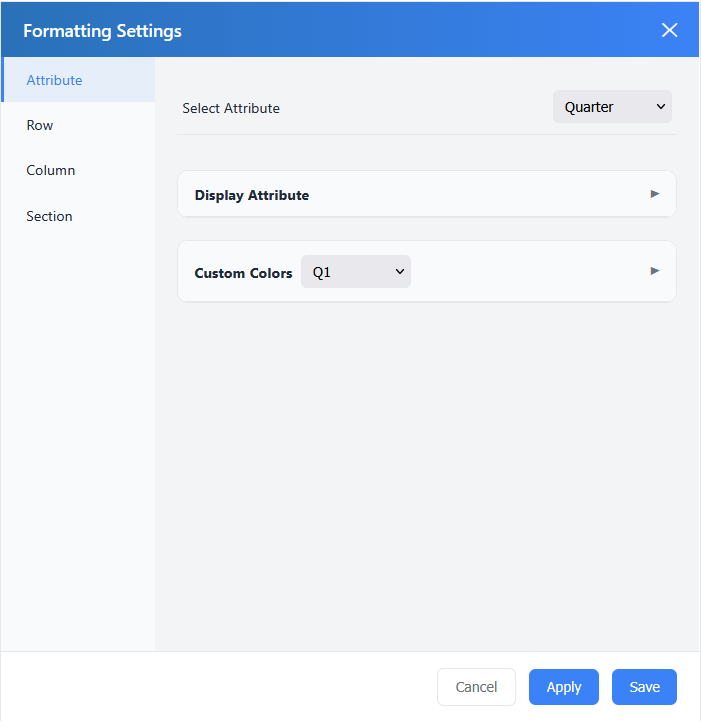
Select Attribute:
In this Dropdown are all Attribute listed from the Rows field. All Changes below are only applying for the selected Attribute.
Display Attribute
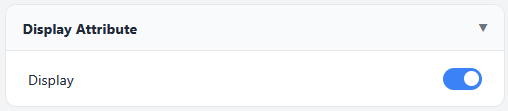
Display:
Enable or Disable the visibility of the Attribute in the first column.
Custom Colors
The Dropdown in the Custom Color Header is a list of all Values from the Select Attribute Dropdown. Set a specific style for a specific value. This feature can later be enabled in Row -> Custom Colors.
Text Color:
Set the Text Color.
Text Style:
Set the Text Style:
- Normal
- Bold
Background Color:
Set the Background Color.
Background Color Opacity:
Set the Background Color Opacity.
Row
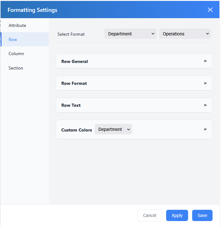
Select Format:
- First Dropdown
- A list of all Attributes in Rows
- Second Dropdown
- A list of all Values from the first Dropdown
- All Changes below only affect the selected Value
Row General
This setting is applying for every Row.
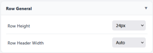
Row Height:
Set the Row Height for every Row.
Row Header Width:
Set the Row Header Width.
Row Format
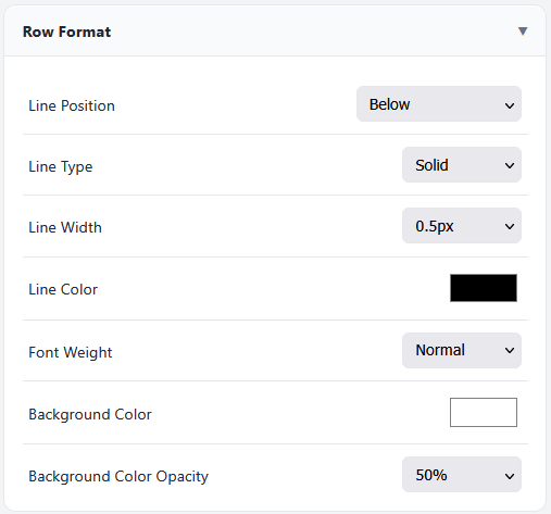
Line Position:
- Above
- Below
- Above & Below
Line Type:
- Solid
- Dashed
Line Width:
Set the Line Width.
Line Color:
Set the Line Color
Font Weight:
- Normal
- Bold
Background Color:
Set the Background Color.
Background Color Opacity:
Set the Background Color Opacity.
Row Text
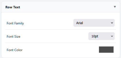
Font Family:
Set the Font Familty.
Font Size:
Set the Font Size.
Font Color:
Set the Font Color.
Custom Colors
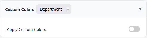
The Dropdown in the Header is listing all Attributes.
Apply Custom Colors:
Enable or Disable the Custom Colors feature.